TemuKerja — Reducing Interaction Demands Across the Job-Search Journey

temukerja

An academic product design project exploring how a job portal could make finding, applying to, and tracking opportunities more manageable for novice job seekers.

Platform

Desktop Web

Role

Product Designer & Researcher

Project Type

Undergraduate Thesis

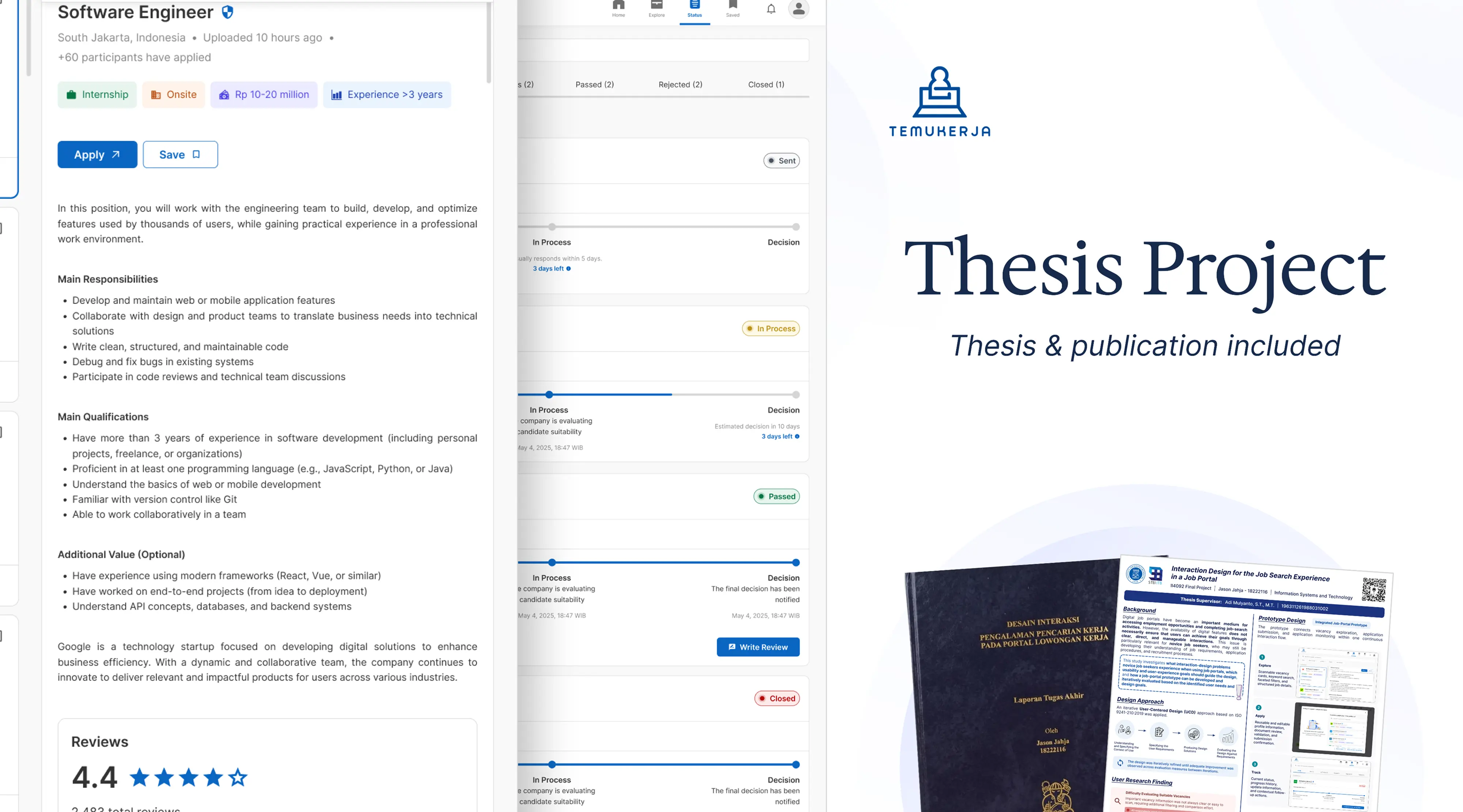
Thesis Project - TemuKerja

Temukerja Thumbnail

Job Searching Is Already Demanding

Digital job portals make opportunities easier to access, but access does not necessarily make the experience manageable. Novice job seekers must interpret whether a role fits their situation, repeatedly prepare information, navigate different application processes, and then understand what happens afterward.

Unclear information, repetitive actions, limited feedback, and a lack of control can add demands to an already difficult journey.

How might interaction design reduce unnecessary demands while giving novice job seekers clearer information, stronger support, and greater control across the job-search journey?

Observing the Journey Before Deciding What to Design

The research began with 8 novice job seekers through contextual observation and semi-structured interviews. Participants used the portal they normally relied on and searched for a vacancy they considered suitable.

I observed how they searched and filtered, what information they used to evaluate suitability, where friction appeared, how they responded when support was insufficient, and what happened beyond simply finding a vacancy. Interviews then explored previous experiences, difficult activities, information needs, expected support, and responses to frustrating interactions.

The qualitative findings shaped a broader questionnaire. 114 responses were collected, with 105 valid responses from people who had submitted through a job portal in the previous six months. The survey prioritized recurring problems rather than attempting to statistically represent all job seekers.

Among valid respondents, 70.5% were actively searching for employment, 98.1% had less than two years of professional experience, and 66.7% most frequently used desktop devices. These characteristics supported both the novice-user focus and the decision to develop a desktop prototype.

01

Evaluating whether a vacancy was worth pursuing required substantial information work

Users rarely judged a vacancy from its title alone. They repeatedly opened vacancies, scanned long descriptions, identified relevant details manually, and compared position, company, location, working arrangement, salary, qualifications, and credibility across opportunities.

  • 43 respondents found determining suitability difficult
  • 74.3% valued information clarity
  • 71.4% valued complete search filters
Users need to narrow opportunities and recognize relevant information without repeatedly opening and interpreting multiple vacancies.

02

Applying repeatedly created administrative work the system could have reduced

Application flows repeatedly asked for information already available in a profile or CV. Moving between platforms and relearning different form structures added effort, sometimes leading participants to postpone, avoid, or abandon an application.

  • 30 respondents found completing application information difficult
  • 44.8% valued automatic completion using profile or CV data
The system treated every application as an isolated task, while the user experienced applying as a repeated activity.

03

Submission did not necessarily give users a clear sense of progress

After applying, users still needed to understand the application’s current condition and decide what to do next. Limited feedback led them to repeatedly check portals and email for updates.

  • 72 respondents found obtaining status information difficult
  • 46.7% selected monitoring as the most difficult stage
  • 62.9% valued status tracking
For users, the journey did not end at “Submitted.”

Using Theory to Understand Why These Interactions Mattered

Because this was an academic research project, the design criteria needed to go beyond conventional ideas of a “good UX.” Two theoretical perspectives helped interpret the findings and translate them into design qualities.

Emotional Design

Emotional Design framed experience across three levels rather than treating task completion as the whole experience.

Visceral: Can important information, controls, and hierarchy be recognized quickly without creating an immediate sense of overload?

Behavioral: Can users complete tasks, understand flows, receive feedback, avoid unnecessary repetition, and maintain control?

Reflective: Does the portal feel useful, integrated, transparent, supportive, and trustworthy across the broader journey?

Transactional Model of Stress and Coping

The model treats experience as an appraisal of the demands a situation creates and the resources available to deal with them.

Primary appraisal: Users may see manually locating information, re-entering data, learning unfamiliar structures, switching systems, and repeatedly checking updates as disproportionate demands.

Secondary appraisal: Clear information, reusable data, visible feedback, editable inputs, progress visibility, and recovery options can provide resources and control.

Interviews also revealed coping responses when demands became too high: delaying applications, taking breaks, avoiding unfamiliar recruitment sites, or abandoning an application entirely.

Which interaction demands can the product remove, and what resources or control should it provide instead?

Five Measurable Design Goals

The frameworks were not academic decoration. Together with the research, they defined what the experience needed to achieve and later determined how the prototype would be evaluated—connecting research, design decisions, and validation.

Satisfaction did not mean making job searching inherently enjoyable. It meant ensuring the product worked according to users’ needs without adding avoidable barriers of its own.

01

Effectiveness

Enable users to explore and evaluate vacancies, submit applications, manage opportunities, and understand progress.

02

Efficiency

Reduce repeated input, unnecessary steps, manual information searching, and avoidable movement between flows.

03

Learnability

Make information structure, labels, controls, system responses, and interaction patterns understandable to novice users.

04

Helpful

Support evaluation, repeated application work, progress monitoring, and decisions about what to do next.

05

Satisfying

Provide understandable feedback, sufficient support, and control without adding avoidable interaction barriers.

Choosing the Product Model

The findings did not automatically mean another job portal was the answer. I compared three product models before committing to a direction.

Concept 01

Cross-platform Job Search Assistant

Strength

Could support users across several existing platforms.

Trade-off

Dependent on external platform structures, permissions, available information, and technical policies.

Concept 02

Centralized Job Search Manager

Strength

Could create a broader overview of opportunities and applications.

Trade-off

Searching and applying would still happen elsewhere, limiting control over the interactions causing friction.

Concept 03

Integrated Job Portal

Strength

Connected exploration, application, and monitoring with control over hierarchy, data reuse, feedback, and progress.

Trade-off

Selected as the strongest prototype environment for investigating all three problems

One Connected Journey

The three problems were connected. Poor information made evaluation harder; applying introduced repeated administrative work; and unclear progress created uncertainty after users had already invested that effort. The product therefore preserved context across exploration, evaluation, application, and tracking instead of treating each stage as an isolated workflow.

01 — Making Vacancies Easier to Scan

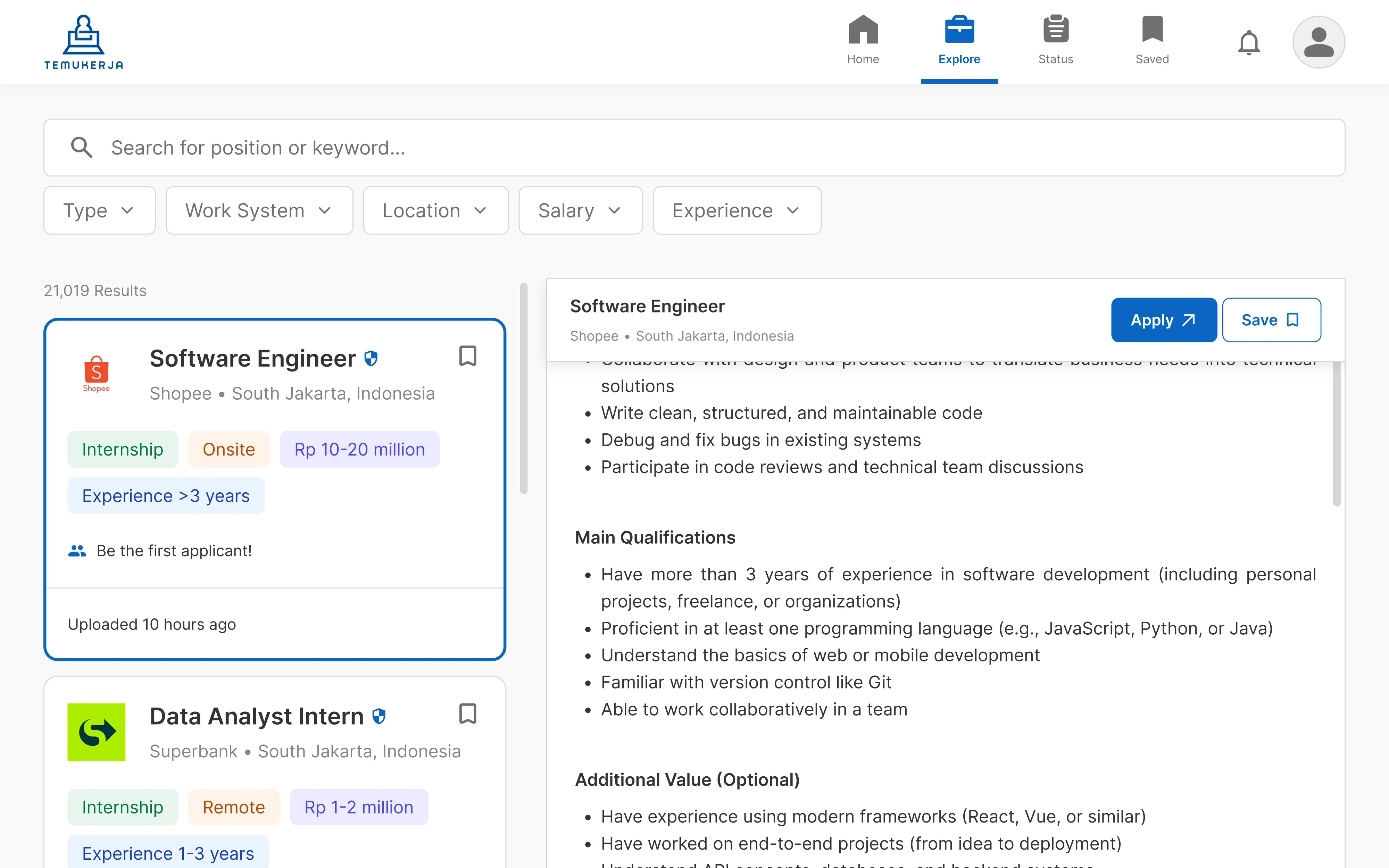
Users needed both speed and depth. The exploration experience made essential information easier to scan while keeping deeper job and company details accessible without losing browsing context.

Make relevant information easier to locate while reducing unnecessary navigation and comparison effort.
insight
1

Keyword search and faceted filters help narrow the opportunity set.

2

Structured summaries make essential vacancy information easier to scan.

3

A master-detail pattern keeps the result list visible while users investigate an opportunity.

4

Progressive disclosure keeps complete job and company information accessible when deeper evaluation is needed.

5

Saved vacancies preserve relevant opportunities for later review.

02 — Treating Repeated Applications as Repeated Behavior

The application flow reduced repeated administrative work while keeping reused information and important submission decisions transparent and under the user's control.

Reduce repeated administrative work while maintaining transparency and user control.
insight
1

Stored profile data and documents reduce repeated input.

2

Populated information remains visible, editable, and connected to its source.

3

Users can choose documents, return to previous steps, and review the complete submission before committing.

4

Required-field indicators, validation, and understandable errors clarify what needs attention.

5

Confirmation prevents users from accidentally losing unsaved changes.

03 — Making Progress Visible After Submission

Monitoring became an extension of the application journey rather than a detached status page, supporting a continuous search–apply–monitor loop after submission.

Replace unnecessary checking with clearer feedback and help users determine the next appropriate action.
insight
1

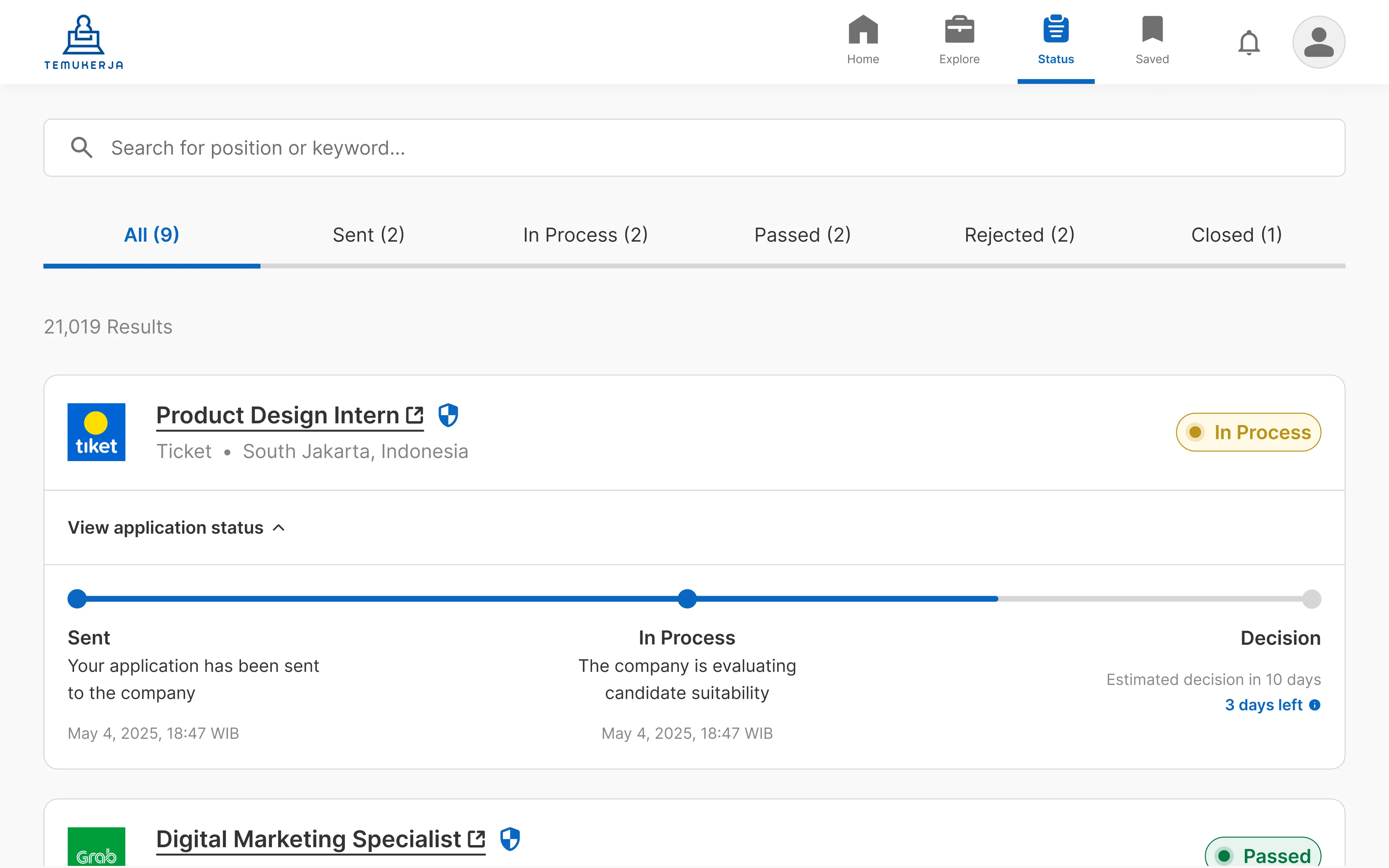
Current status and update timestamps make recent progress visible.

2

Progress history and notifications reduce the need for repeated checking.

3

Contextual next actions help users understand what they can do after submission.

4

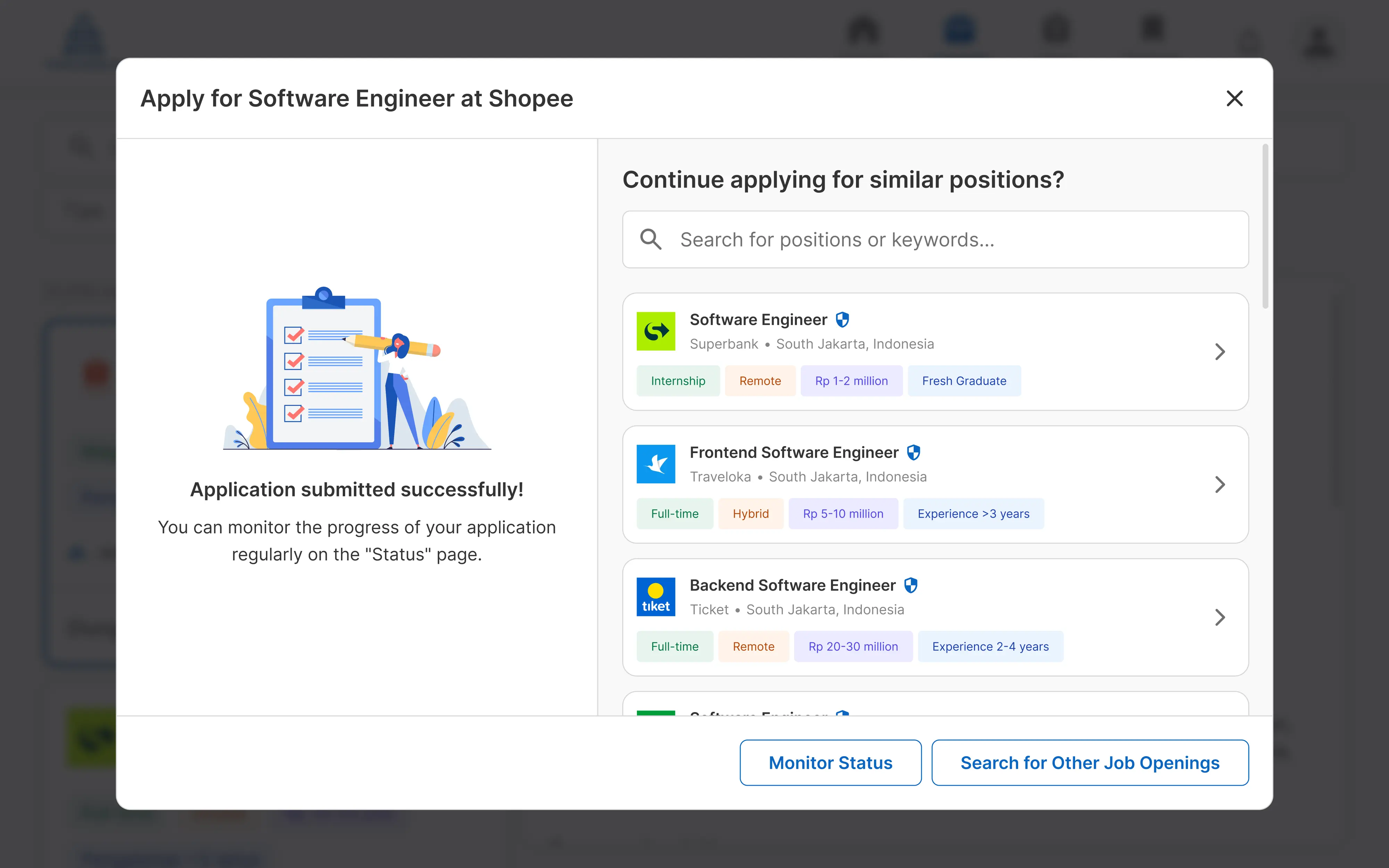
The success state lets users monitor the application or return to exploring opportunities.

Testing Before High Fidelity

I first confirmed the low-fidelity prototype with 5 target users in moderated think-aloud sessions. The purpose was not to measure final usability, but to determine whether the information hierarchy, labels, interaction sequence, interface states, and data-reuse model were understandable enough to justify moving forward.

Findings led to revisions in information hierarchy, labels, transitions, and how reused profile information was communicated before I moved into high-fidelity prototyping.

Three Formative Evaluation Rounds

The high-fidelity prototype was tested through 3 formative iterations with 5 participants per iteration. Every round evaluated vacancy exploration, application using stored information, and application progress monitoring.

Evaluation combined task success, direct versus indirect completion, time on task, Single Ease Question, adapted NASA-TLX workload, and the Usefulness, Ease of Learning, and Satisfaction dimensions from USE. Observations, interaction paths, comments, and post-test interviews helped explain the quantitative results.

The adapted NASA-TLX was used only as an indicator of subjective interaction workload—not as a measure of overall psychological job-search stress.

Users could successfully finish a task while still struggling with the interaction.

Iteration 1 — Success Was High, but the Paths Were Not

Overall completion was already 100%, but only 53.3% of attempts followed the intended path: exploration reached 100% direct success, application 20%, and monitoring 40%.

Navigation and actions lacked visibility, vacancy information was hard to scan, profile reuse needed explanation, post-submission actions were unclear, and progress was difficult to locate. Task completion alone would have hidden most of these problems.

Iteration 2 — Fixing One Problem Exposed the Next

I revised navigation, vacancy presentation, application onboarding, communication around stored data, the success state, and status presentation. Direct success reached 20% for exploration, 80% for application, and 80% for monitoring60% overall.

The exploration scenario had changed to require more specific search and filtering behavior, so Iterations 1 and 2 were not treated as a controlled comparison. Participants also ignored sorting; rather than add explanation to force its use, I removed it and retained keyword search plus faceted filtering. Status became more contextual and post-application actions clearer.

Iteration 3 — The Experience Became More Direct

Vacancy exploration and application submission reached 100% direct success, while monitoring reached 80%. Tracking therefore remained the clearest opportunity for further refinement.

The result did not mean the design was theoretically perfect. It meant the remaining issue had become considerably narrower and more localized than in previous iterations.

100%

Overall task success

93.3%

Direct success

33.4 sec

Average completion time

6.80 / 7

Average task ease — SEQ

1.50 / 10

Adapted workload

6.55 / 7

Usefulness

6.70 / 7

Ease of learning

6.65 / 7

Satisfaction

Exploration and application both received an average SEQ of 7.0, while monitoring scored 6.4—consistent with the remaining indirect path in that activity.

The Strongest Improvement Appeared Between the Final Two Iterations

Cross-iteration results were treated as formative evidence rather than a controlled experiment. Iterations 2 and 3 offered the clearest descriptive comparison because they used the same participants and testing platform.

MeasureIteration 2Iteration 3
Direct success60.0%93.3%
Completion time51.3s33.4s
SEQ6.606.80
Adapted workload2.401.50
Usefulness6.106.55
Ease of learning6.406.70
Satisfaction6.056.65
The results suggest that the final refinements supported more direct, efficient, understandable, helpful, and satisfying interactions within the tested scenarios.

Participant familiarity and clarified task wording may also have contributed to some improvement, so the changes should not be interpreted as purely causal effects of the interface revisions.

A Usable Interface Still Needs a Product System Behind It

The prototype demonstrated the interaction concept, but several parts depend on systems beyond the interface. Reusable applications require structured storage for profile data, documents, responses, and the exact version submitted. Tracking requires recruiters, applicant-tracking systems, or other recruitment systems to provide reliable updates. Company information and reviews require validation, moderation, and governance.

An initial product could support profile and document management, in-platform applications, internally managed status histories, attribute-based recommendations, and administrator-managed company information. Automated CV extraction, external ATS integration, and user-generated reviews would introduce additional technical and organizational dependencies.

What the Results Do and Don’t Prove

The final prototype performed strongly in formative usability testing, but the evidence describes interaction quality while using the prototype. The adapted NASA-TLX result reflects perceived task demands during interaction; it does not demonstrate reduced psychological stress associated with job searching as a whole.

Because this was an interactive prototype rather than an operational recruitment platform, it does not establish effects on employment outcomes, application conversion, long-term behavior, recruitment success, data accuracy, production performance, or business metrics.

Competition, employer decisions, rejection, personal circumstances, and broader uncertainty cannot be removed by an interface. The claim is narrower: interaction design can reduce avoidable demands introduced by the digital product itself.

Reflection

This project showed me that solving an interaction problem is not the same as adding the feature that appears to correspond to it. More filters did not automatically improve exploration. Reusable information still needed visibility and control. Tracking only became useful when it appeared where users expected it.

It also changed how I evaluate design. Task success was already 100% in the first iteration. Directness, time, workload, perceived ease, and observed behavior revealed the interaction problems that completion alone concealed.

A product should not only make the user’s goal possible. It should reduce the unnecessary effort, ambiguity, and loss of control introduced on the way there.

Explore the Full Project Materials

Scan the QR code to access the supporting academic materials from this project, or click here.

QR code to access TemuKerja thesis, poster, and presentation slides

Included materials

  • 01Undergraduate thesis
  • 02Research poster
  • 03Presentation slides

Continue exploring

More projects across research, commerce, systems, and spatial experiences.