Unguided repeat completion
8 / 8
Completed the repeat Hunch successfully without guidance.

 Product
Mobile App (Food Discovery)
 Role
RoleProduct Designer (Freelance)
 Timeline
Aug 2026 to Sep 2026
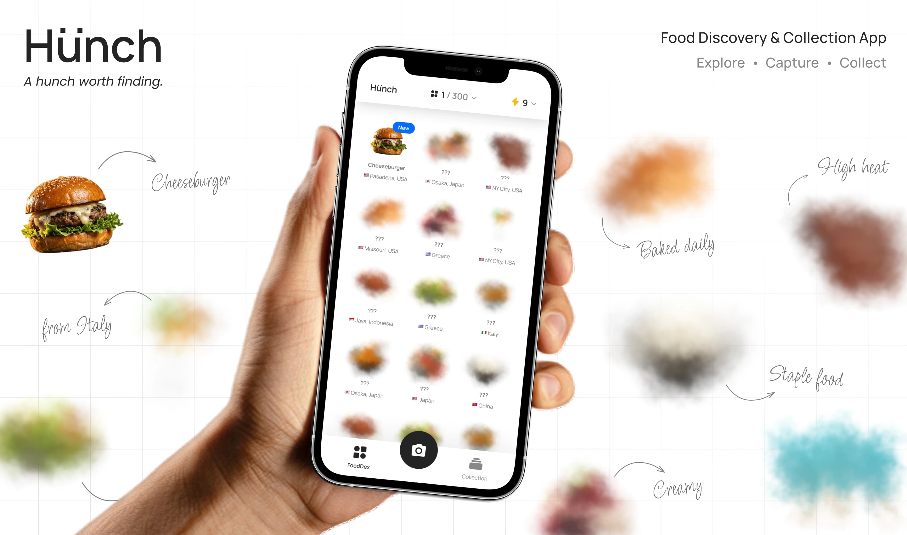
Hunch is a mobile food-discovery and collection app, inspired by “Pokémon Go for food,” where users photograph what they encounter, identify it, and grow their collection one Hunch at a time.
Starting from the product PRD, I shaped the experience end-to-end, structuring the information architecture and core flows, defining the interaction and visual language, building a reusable design system, prototyping key journeys, and preparing the experience for development.
The initial brief defined the main features, but they still needed to work together as one coherent experience. I structured Hunch around a simple recurring loop:
Discover → Hunch → Identify → Collect → Explore
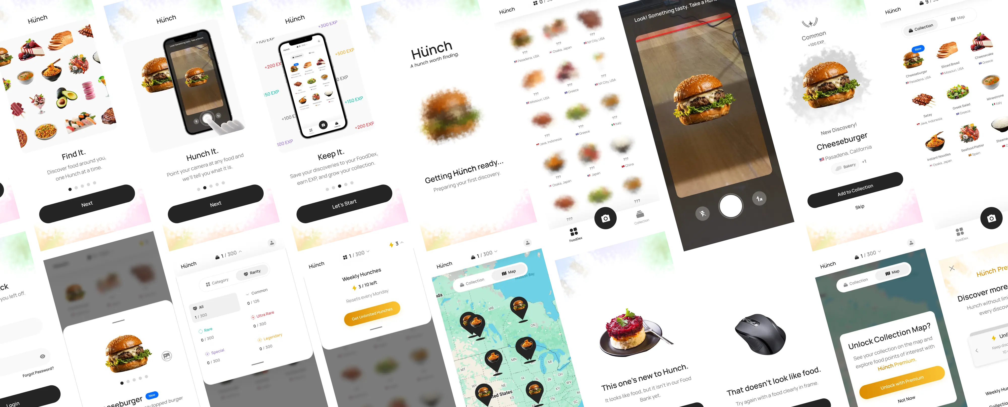
This loop became the foundation for the product architecture, connecting onboarding, camera-based identification, FoodDex, collection, progression, profile, and premium features, while guiding first-time users from a lightweight introduction into their first Hunch.
Instead of explaining every feature in detail through onboarding alone, the first-use experience combines a short product introduction with a dedicated guided tutorial for the core Hunch flow.
A five-step tutorial introduces the interaction upfront, taking users through the Hunch process with clear step-by-step guidance.
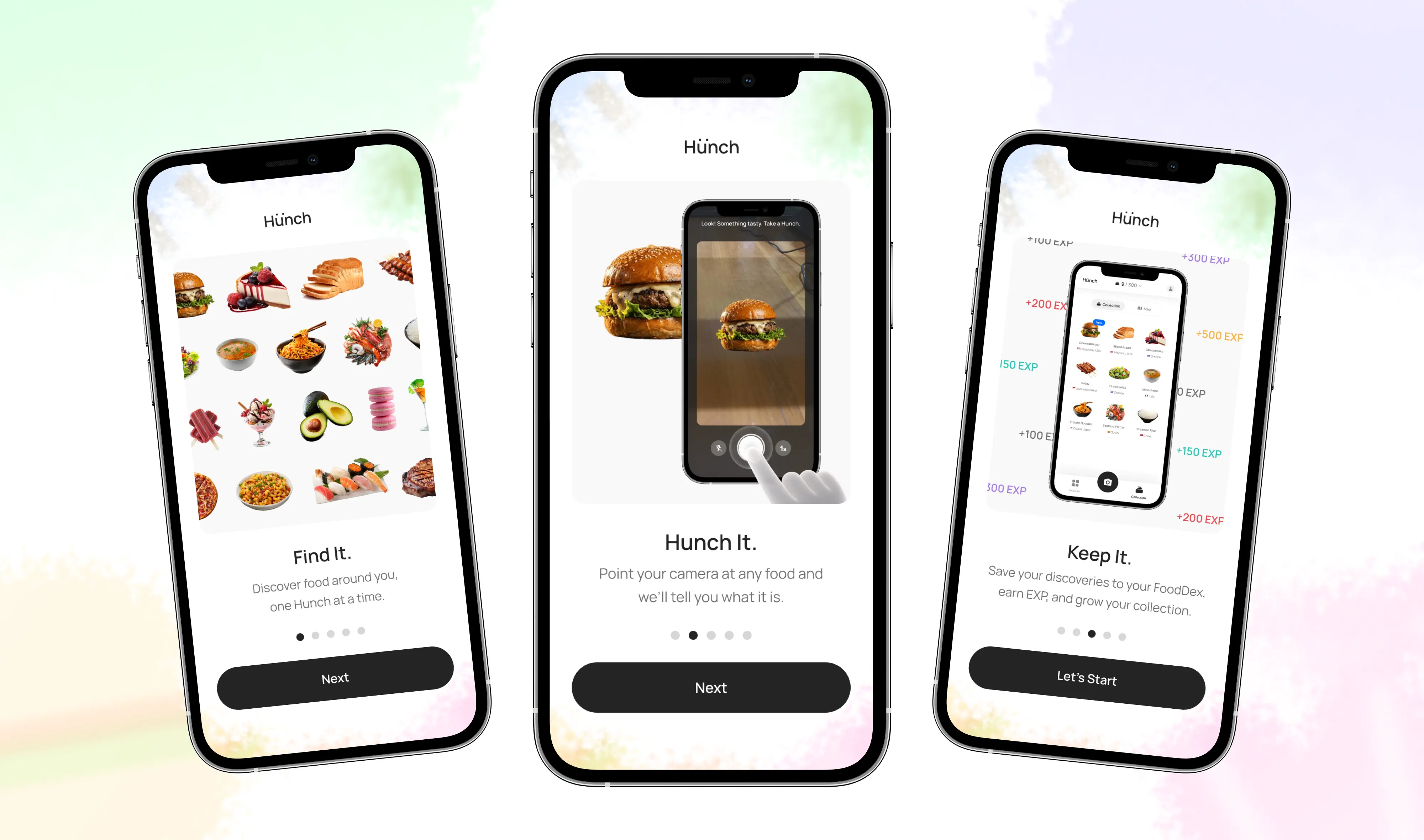
A short introduction frames Hunch around discovering, identifying, and collecting food, giving users context before their first Hunch.
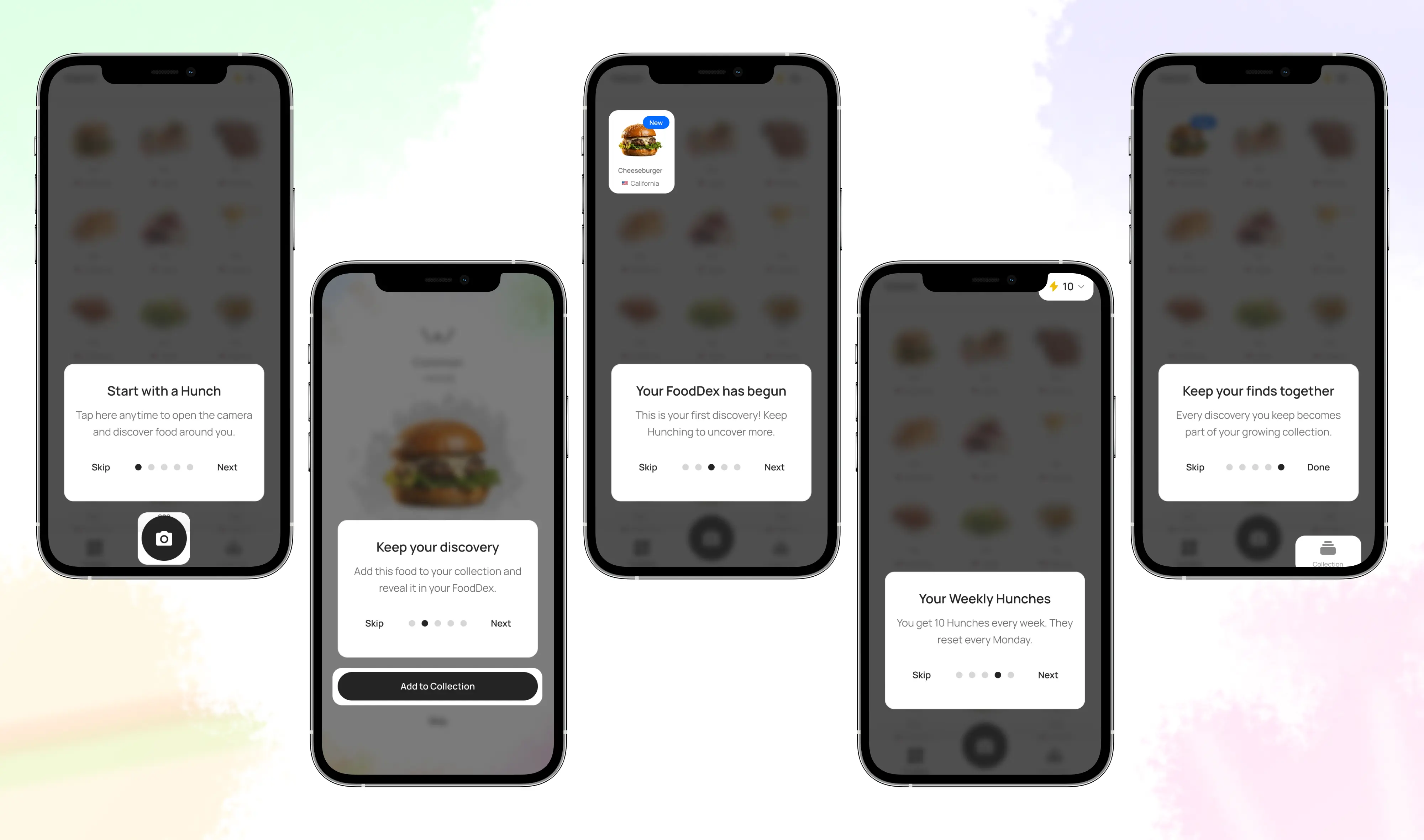
A five-step tutorial explains the core interaction upfront, with clear guidance and the option to skip before starting a Hunch.
Taking a photo is the core interaction in Hunch, so the flow was designed to feel more like discovery than standard image recognition.
The journey moves through distinct states, from capture and processing to identification. Hunch’s cloudy visual language adds anticipation while the food is being identified.
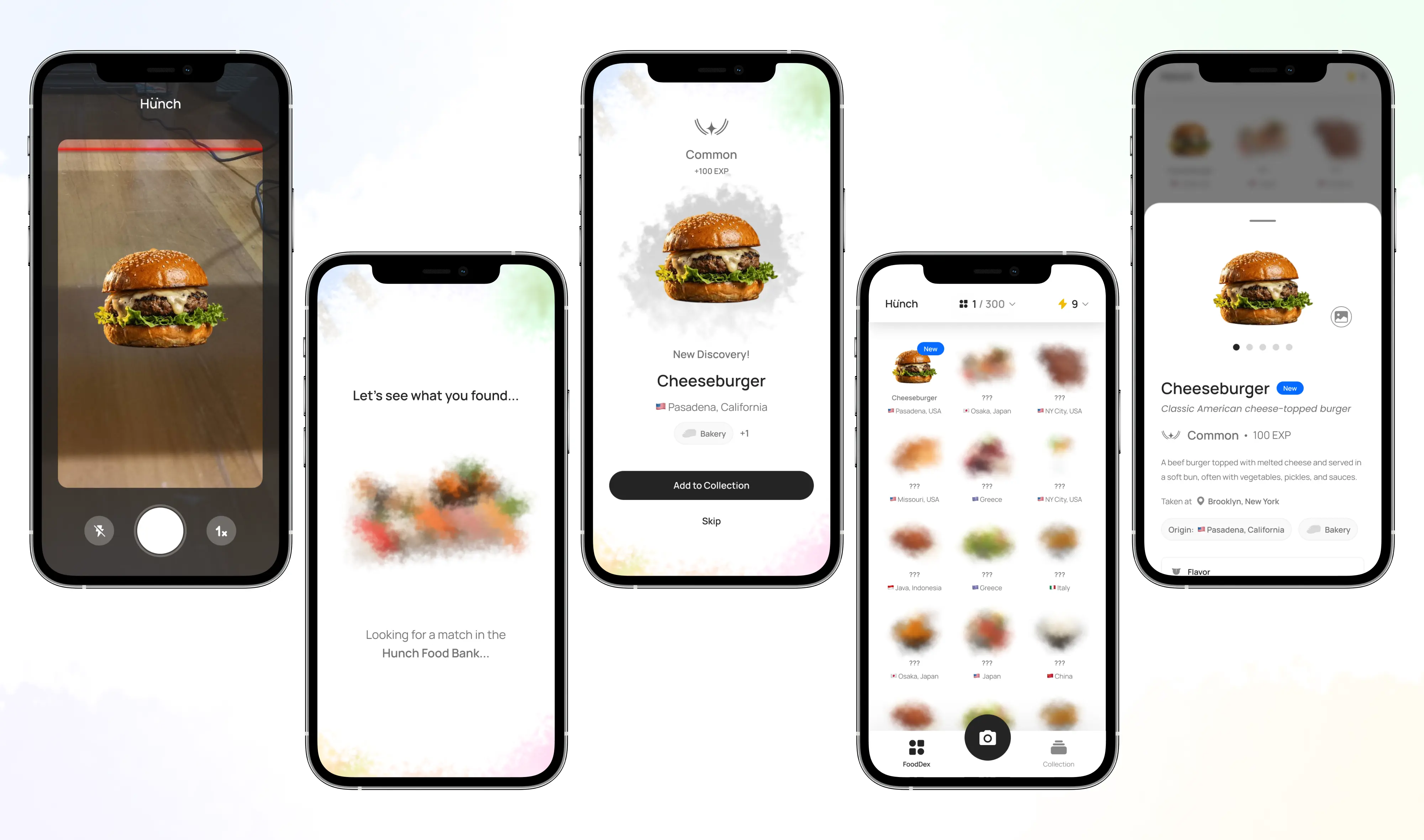
The flow moves clearly from capture, to processing, to identification.
Cloudy processing states add anticipation while Hunch searches for a match.
Identification is only the beginning. Every saved discovery contributes to a growing FoodDex and personal collection, supported by rarity, EXP, levels, and badges.
Together, these systems turn individual food captures into visible progress and give users more reason to continue exploring.
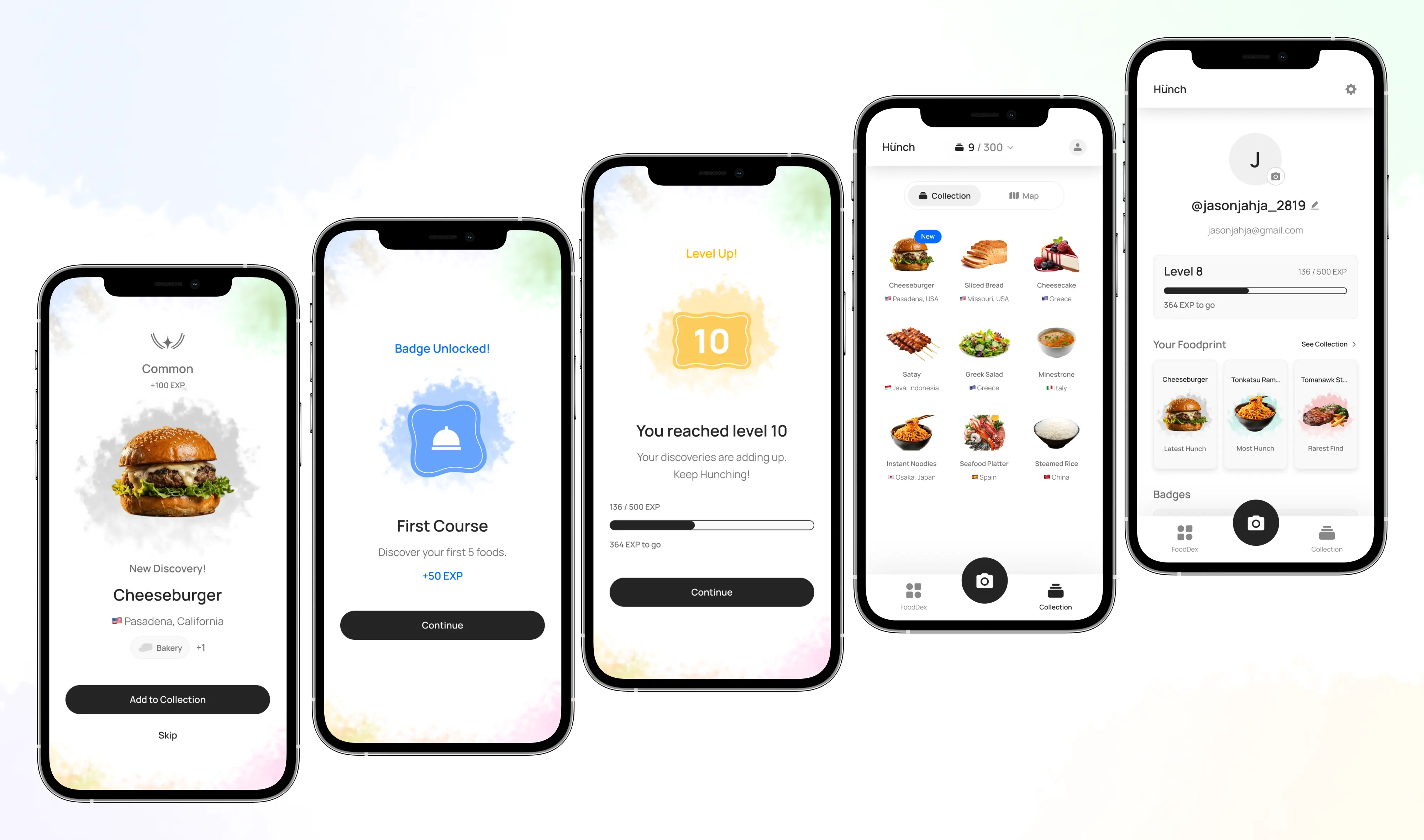
Each saved discovery grows the user’s FoodDex and personal collection.
Rarity, EXP, levels, and badges turn discoveries into visible progress.
Hunch’s visual identity is shaped by two ideas: curiosity as the trigger for discovery, and the visual richness of food itself.
Hunch’s identity starts from the idea of curiosity before certainty. The wordmark turns its two square dots into glancing eyes, while soft cloudy textures carry that sense of anticipation across the brand.
The square dots act as glancing eyes, always looking toward the next discovery.
Soft cloudy textures give the brand a sense of curiosity and uncertainty.
The client wanted Hunch to feel fast and immediate, so I explored how much gamification the interface could carry without slowing the core interaction. At the same time, the visual direction needed to support Hunch’s collectible identity while working with food as an already rich visual subject.
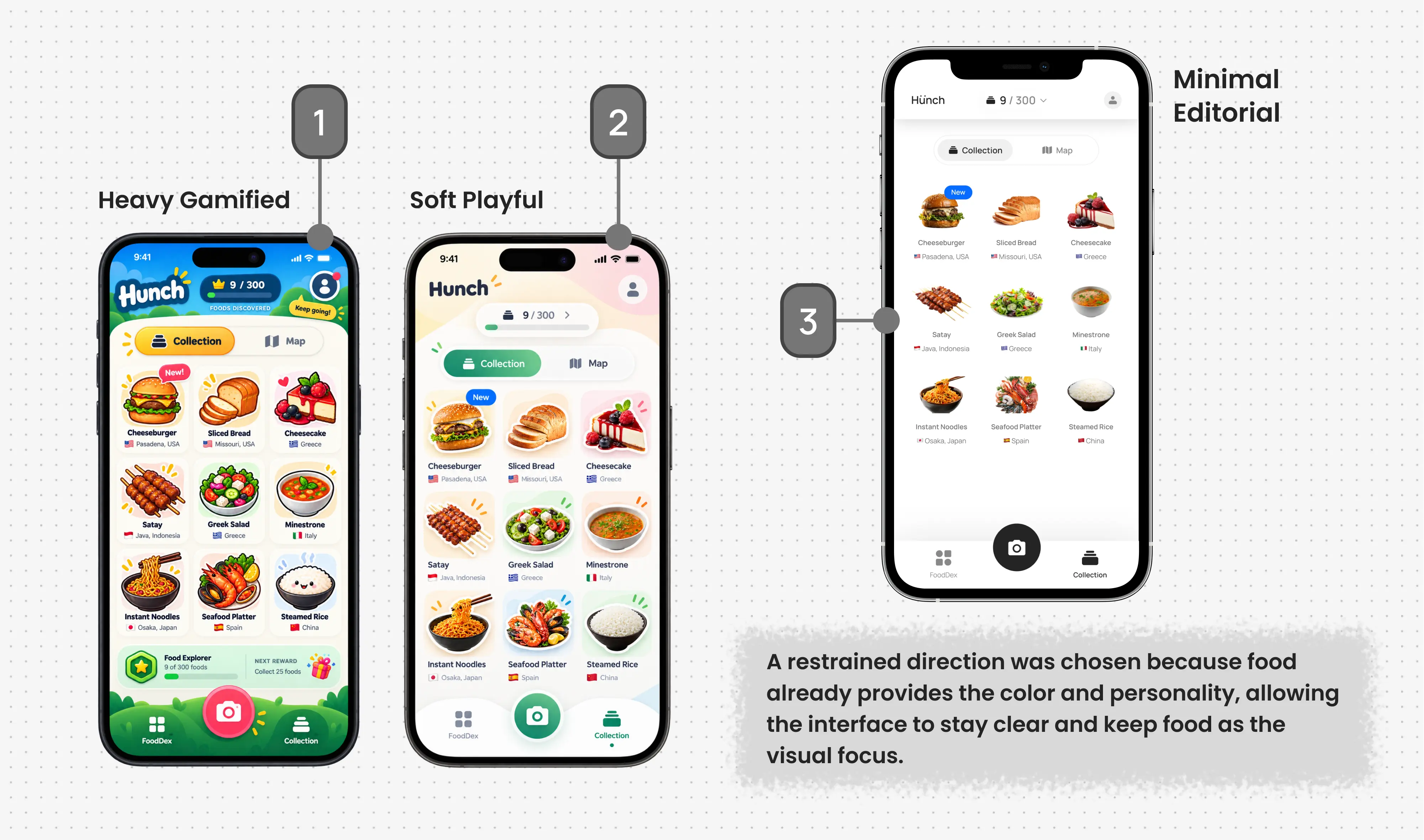
Playful and energetic, but competes with the food for attention.
Adds personality while keeping the interface relatively structured.
Keeps the food as the visual focus with the clearest interaction hierarchy.
Undiscovered foods needed to hide their identity without making the FoodDex feel empty. I explored different treatments to understand how much of the food should remain visible before it is discovered.
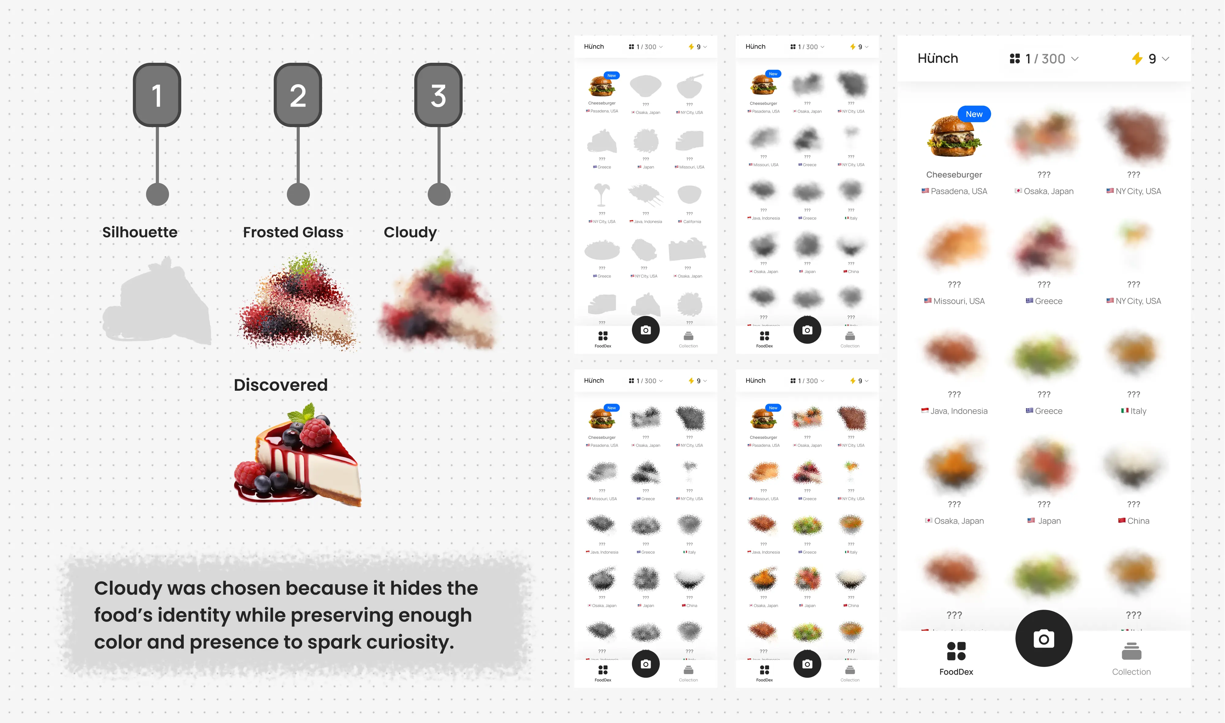
Reduces the food to its outer shape, but removes too much visual richness and makes different foods feel less distinct.
Keeps the food present and partially visible, but feels more like a surface effect than part of Hunch’s core visual language.
Obscures the food while preserving its color and presence, making the undiscovered state feel more curious and on-brand.
I designed Hunch as a reusable system rather than a collection of isolated screens, keeping different outcomes consistent and familiar.
Shared interaction patterns make the experience predictable and easier to extend over time.
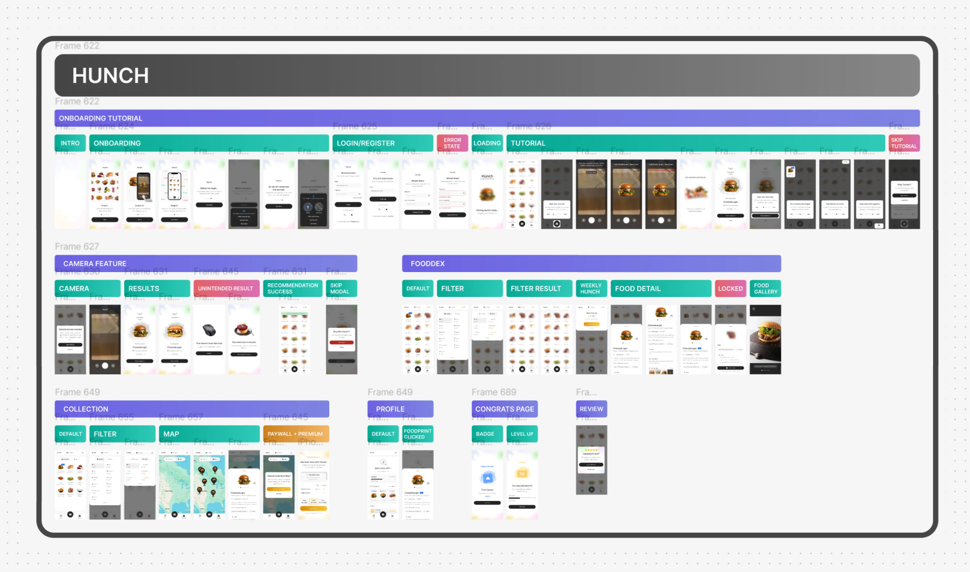
Consistent result patterns make different outcomes easy to understand.
Limits and Premium states keep the next action clear.
Badges and level-ups share one celebration pattern.
I tested the interactive prototype with 8 participants, covering onboarding, the guided first Hunch, and a later repeat Hunch without guidance.
Unguided repeat completion
Completed the repeat Hunch successfully without guidance.
Repeat-flow ease
Average ease-of-use rating for the unguided repeat flow.
Understanding after tutorial
Rating given by all participants after the guided first Hunch.
Repeat completion time
Median time compared with the guided first-use flow.
The guided first-use flow included additional tutorial steps, so the timing difference is treated as a repeated-use observation rather than a controlled efficiency measure.
Testing showed that the core interaction was highly learnable, with participants consistently praising the guided tutorial for its clarity. The main opportunity was to make the post-identification experience clearer, showing how saving a discovery contributes to the FoodDex and Collection while making collection and progression feel like a stronger payoff after each Hunch. Testing also revealed an affordance issue in the tutorial capture state, where the “No food nearby?” action blended into the surrounding camera frame and was not immediately perceived as tappable.
The final delivery brought together Hunch’s product structure, visual identity, reusable components, interaction states, prototype, and implementation-ready assets into a consistent mobile experience.
Shared patterns and documented product behaviours helped keep the experience consistent across core flows and edge cases, while making the system easier to carry into development.
Hunch ultimately evolved from an initial product brief into a complete food-discovery experience built around a recurring loop of curiosity, discovery, and collection.
More projects across research, commerce, systems, and spatial experiences.
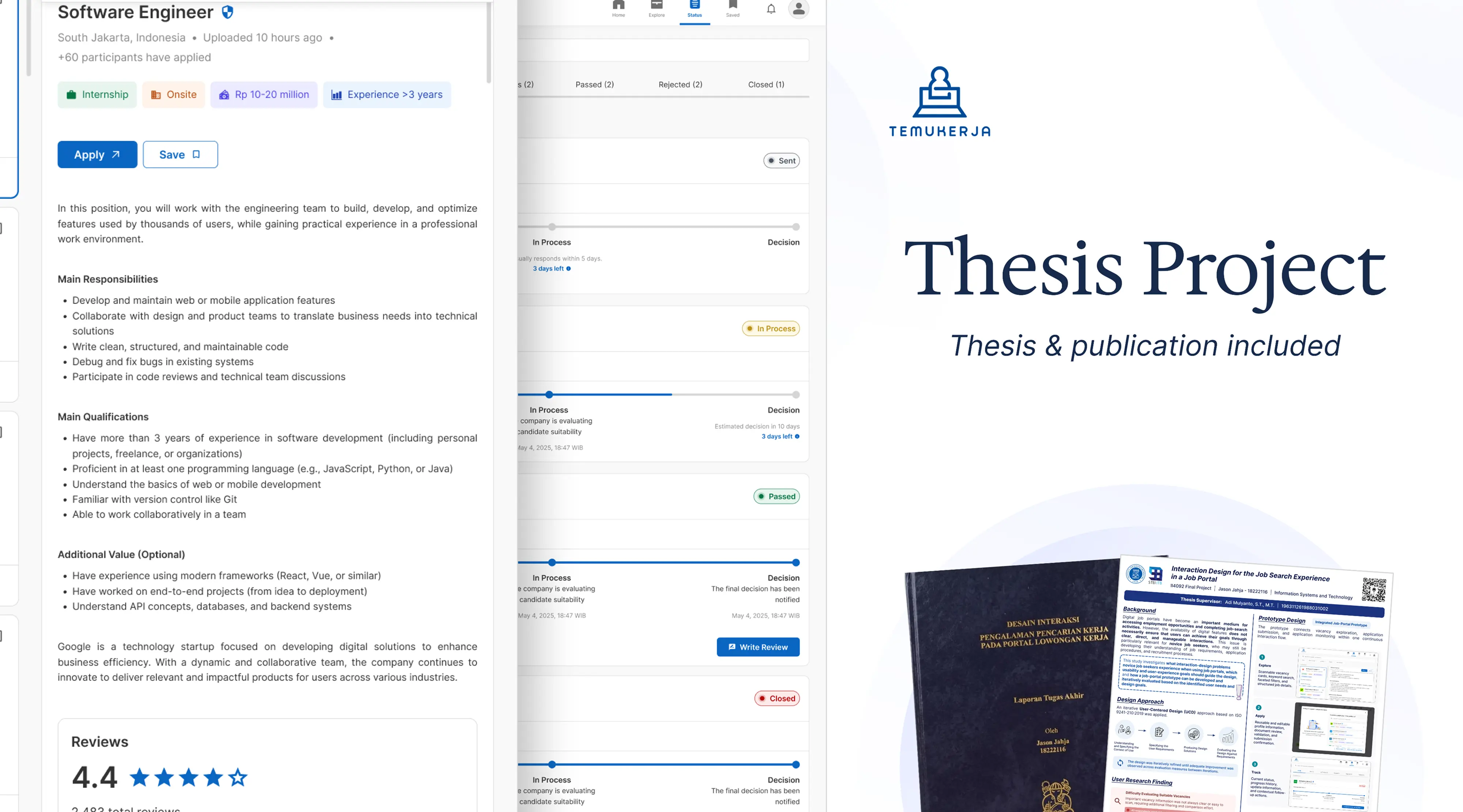
An undergraduate thesis developed through user research and three rounds of formative usability testing with novice job seekers.
UX Research · Usability Testing · Job Portal
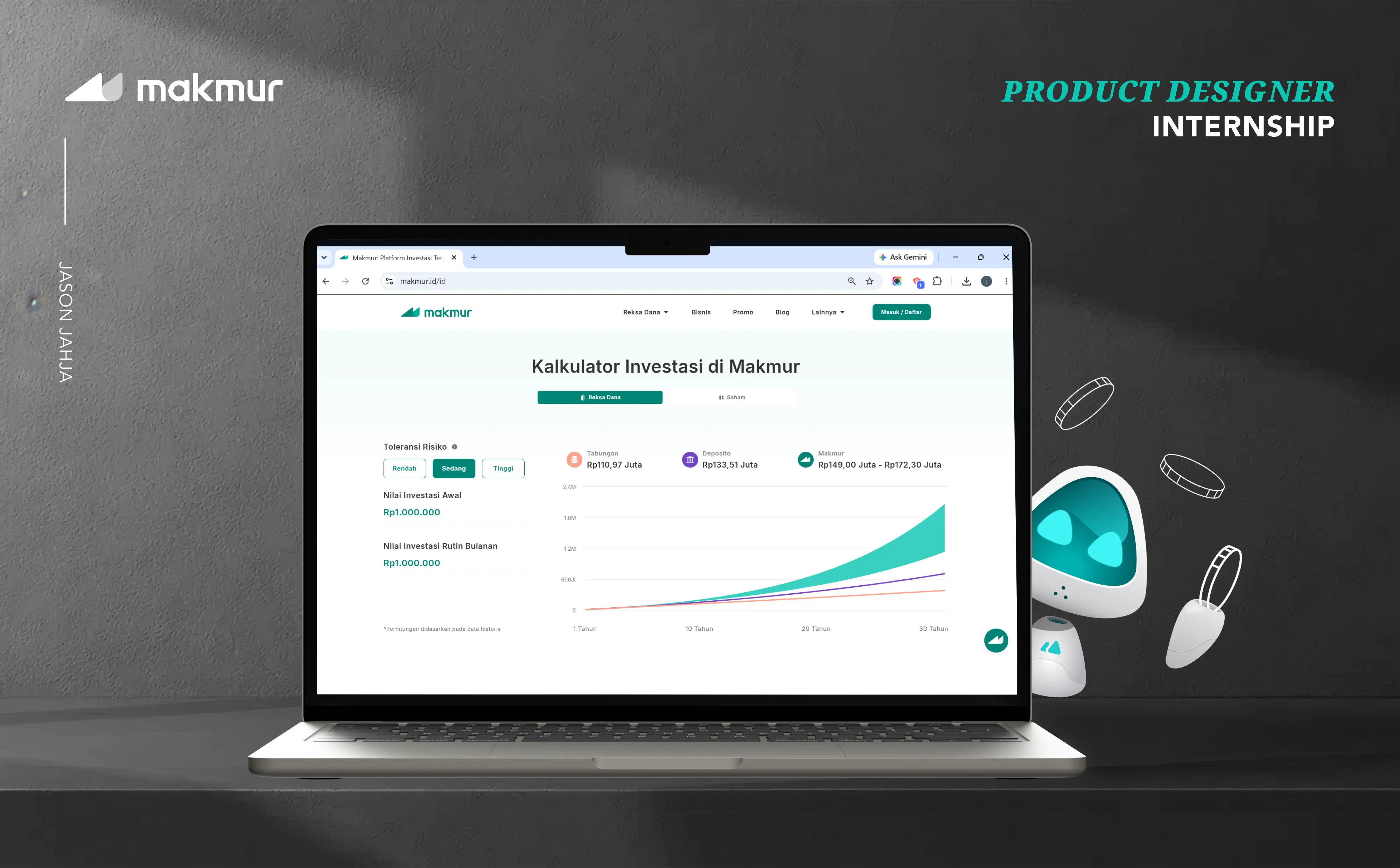
Product work across multiple web and desktop initiatives during my internship, from reusable components to responsive interface behavior.
Design Systems · Responsive UI · Internship
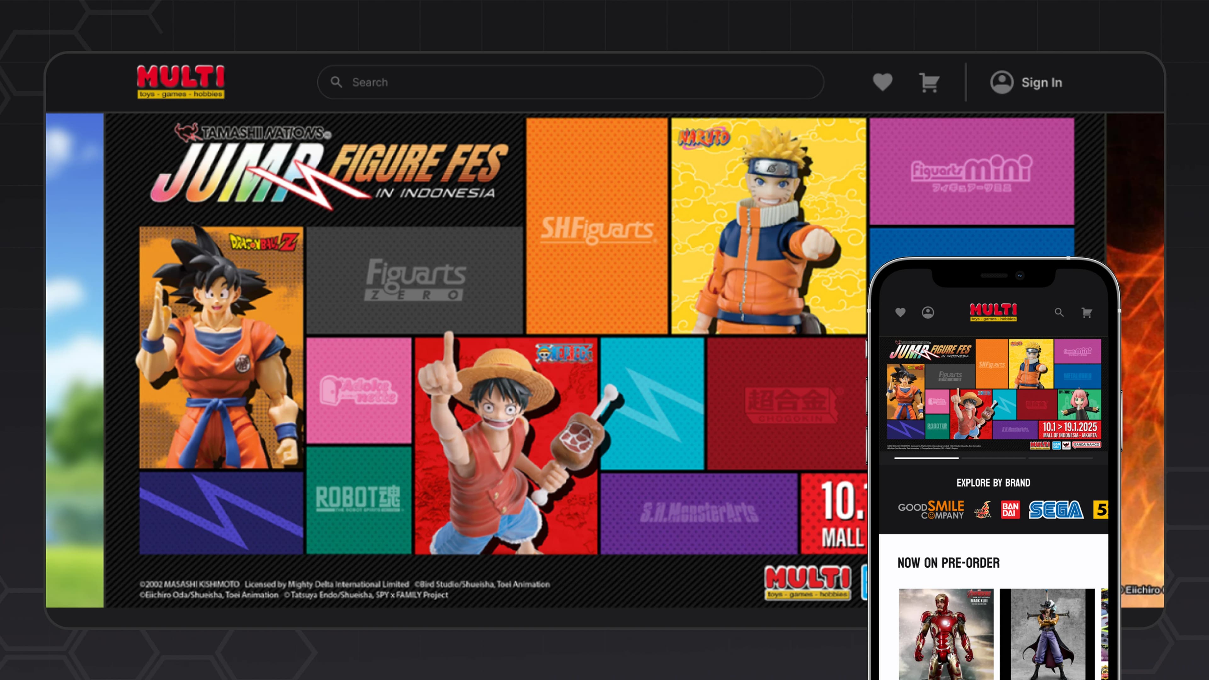
A responsive e-commerce redesign spanning the homepage, catalog, product detail, cart, checkout, and supporting shopping flows.
Redesign · E-commerce · Responsive Web