Product Focus
5.71 → 6.00 / 7
How clearly the experience presented collectibles as the primary focus and represented a hobby / collectible store.


Retail brand specializing in collectible figures, anime merchandise, and hobby products, with a strong offline presence.
 Product
Website (E-commerce)
 Role
RoleProduct Designer (End-to-end)
 Timeline
Sep 2025 – Oct 2025
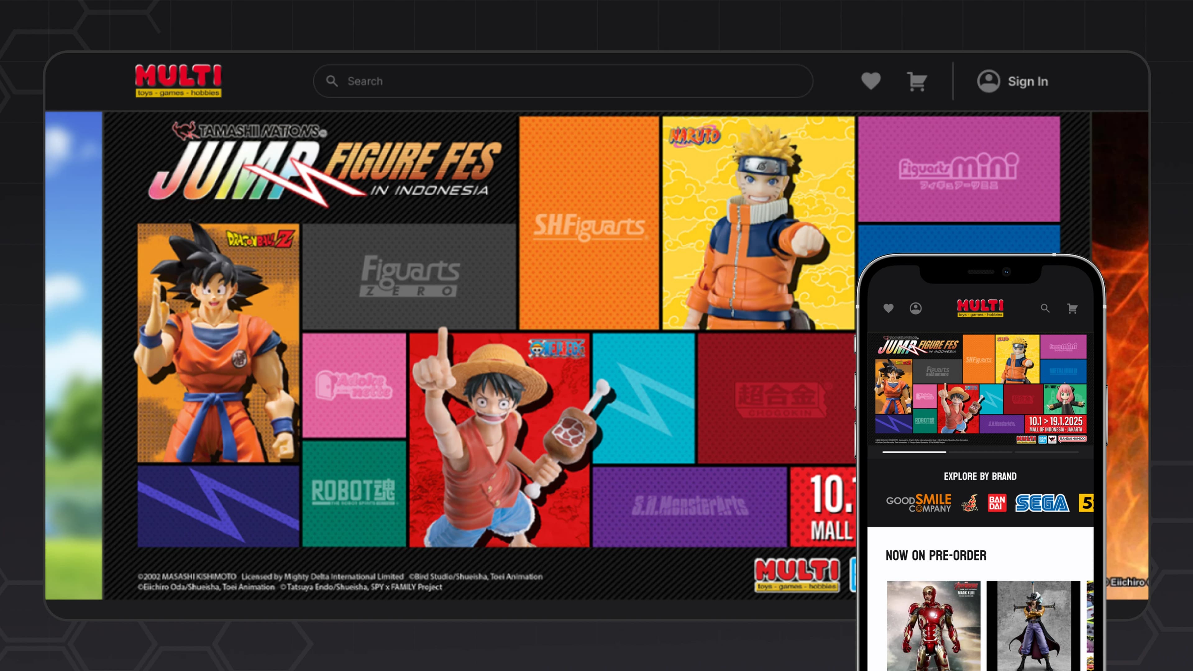
MULTI Toys website redesign
The project was not about introducing an entirely new digital product. The existing website already supported shopping, but it did not present the brand and its products as clearly or intentionally as it could.
Within the available timeline, I focused on high-impact improvements across product presentation, browsing structure, information hierarchy, purchase-decision cues, and responsive behavior.
During initial discovery, I did not have access to prior user research or product analytics. Initial understanding therefore came from an audit of the existing website, the client and project context, and benchmarking comparable collectible and branded-commerce experiences.
The audit suggested that the problem was not missing content. Important actions, campaigns, categories, and merchandise often occupied the same visual layer, making it harder to understand what deserved attention first, where browsing should continue, and which information mattered during evaluation.
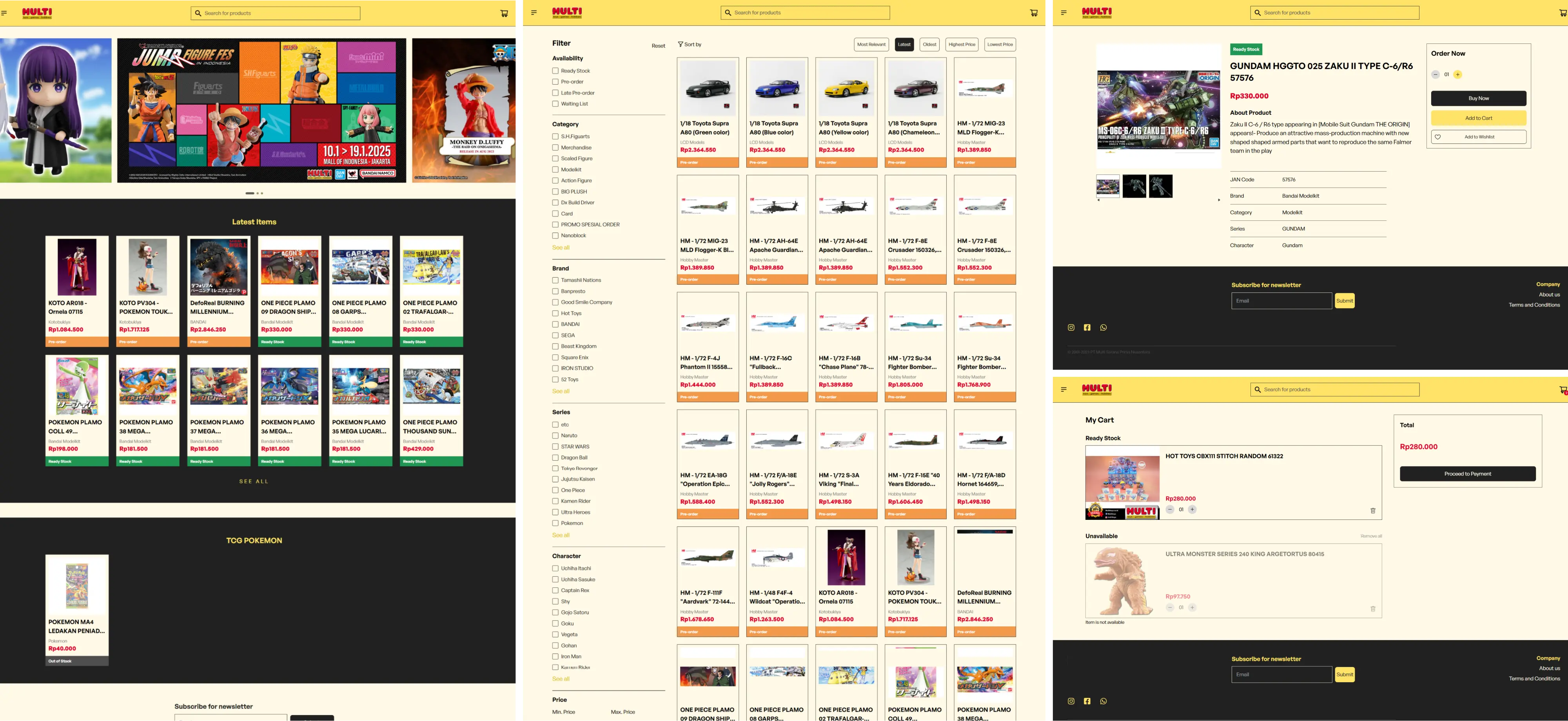
The existing product already contained rich campaigns, products, and supporting modules; the redesign focused on how those elements related to one another.
The audit findings were synthesized into three structural problems that connected interface presentation with browsing and evaluation.
Visual emphasis is distributed across competing interface elements, while products, key actions, and supporting content lack a clear sense of priority.
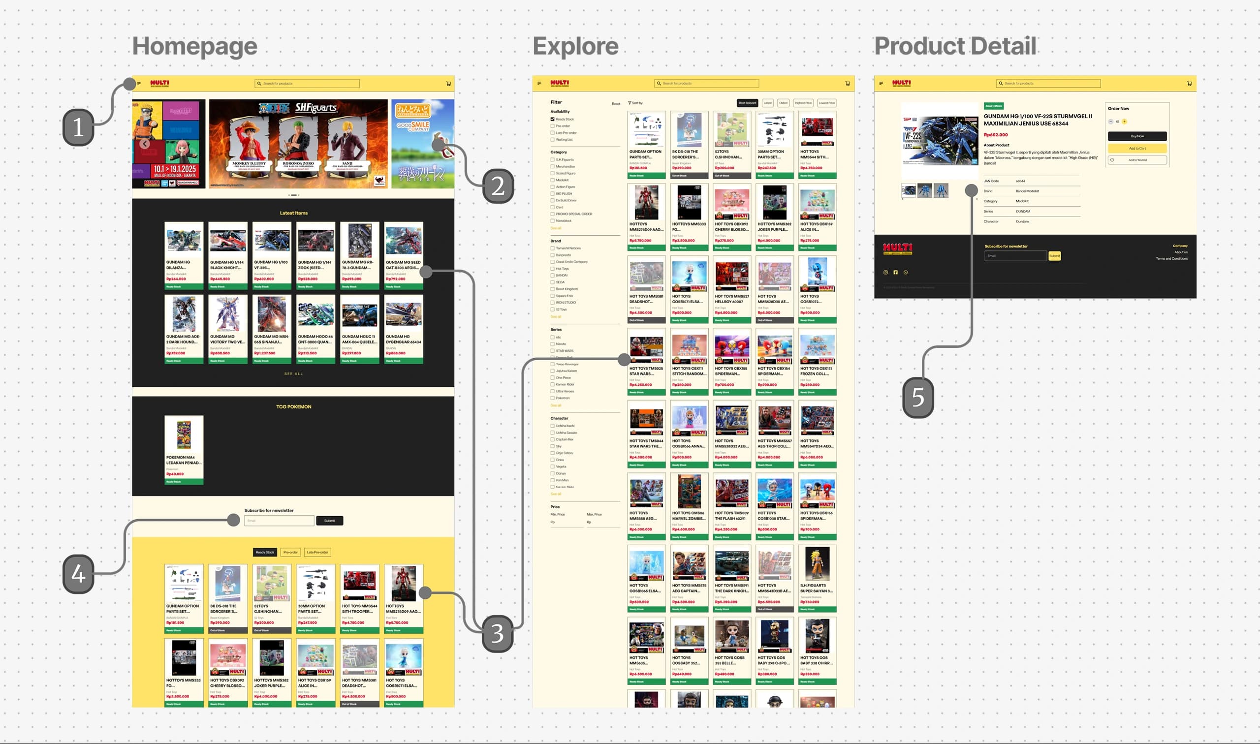
Profile and wishlist actions are hidden despite available navigation space.
Hero section lacks visual prominence.
Product cards receive limited attention due to their size and density.
Newsletter placement is easily overlooked.
Product imagery receives less emphasis than secondary information on the product detail page.
Strong background colors reduce emphasis on products and key content.
Products are surfaced throughout the experience, but the browsing structure provides limited progression from featured content into broader catalog exploration.
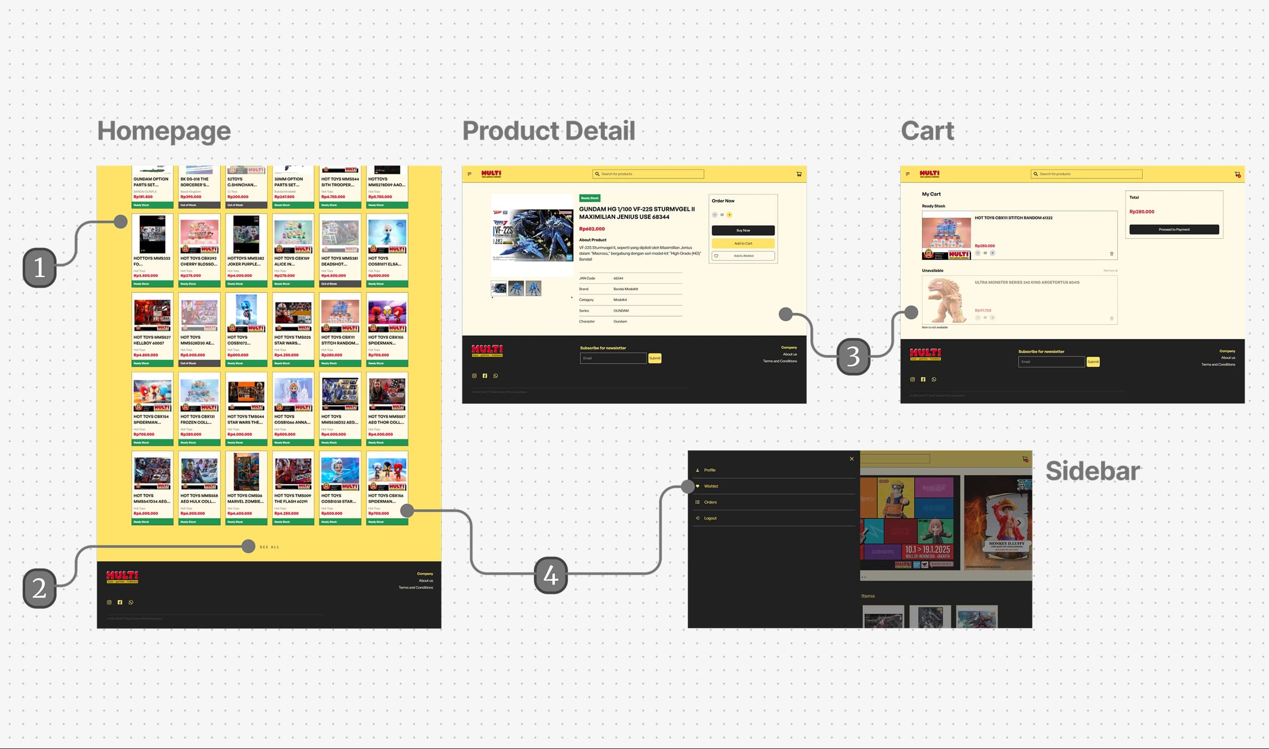
Products are continuously surfaced through infinite scrolling on the homepage.
The transition from homepage exploration to the full catalog is difficult to find.
No recommendation pathways to encourage continued exploration.
Wishlist are not easily accessible during browsing, making it harder to save and revisit products.
Product availability and purchase actions are not differentiated strongly enough, providing limited cues for evaluating purchasing context and possible next actions.
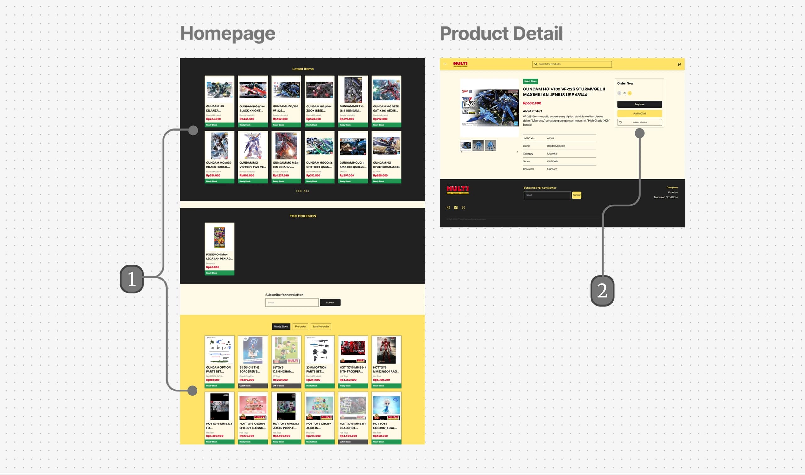
Available and pre-order products are presented similarly despite serving different purchase intents.
Purchase actions receive limited prominence within the product detail page.
I compared a range of branded-commerce and collectible retail experiences to understand how large catalogs could balance exploration with retrieval. Across these references, two broad interaction patterns emerged: some experiences emphasized visual discovery through large imagery, curated product groups, thematic browsing, and guided entry points, while others prioritized structured retrieval through denser catalogs, stronger categorization, search, filtering, and more direct product access.
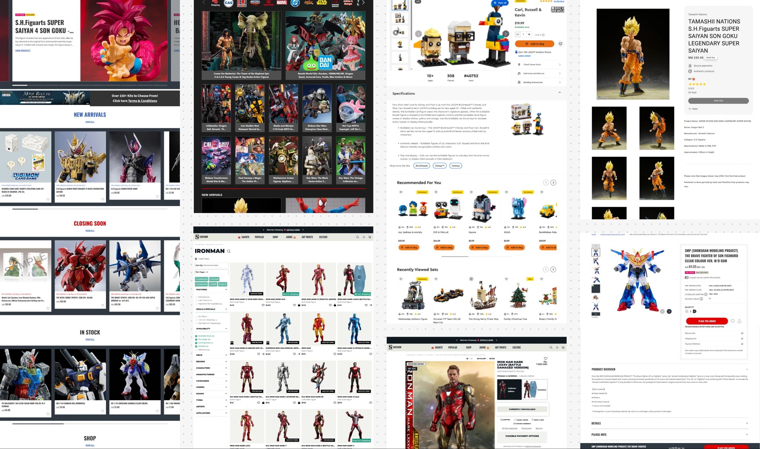
Large product imagery
Curated product groups
Thematic browsing
Guided entry points
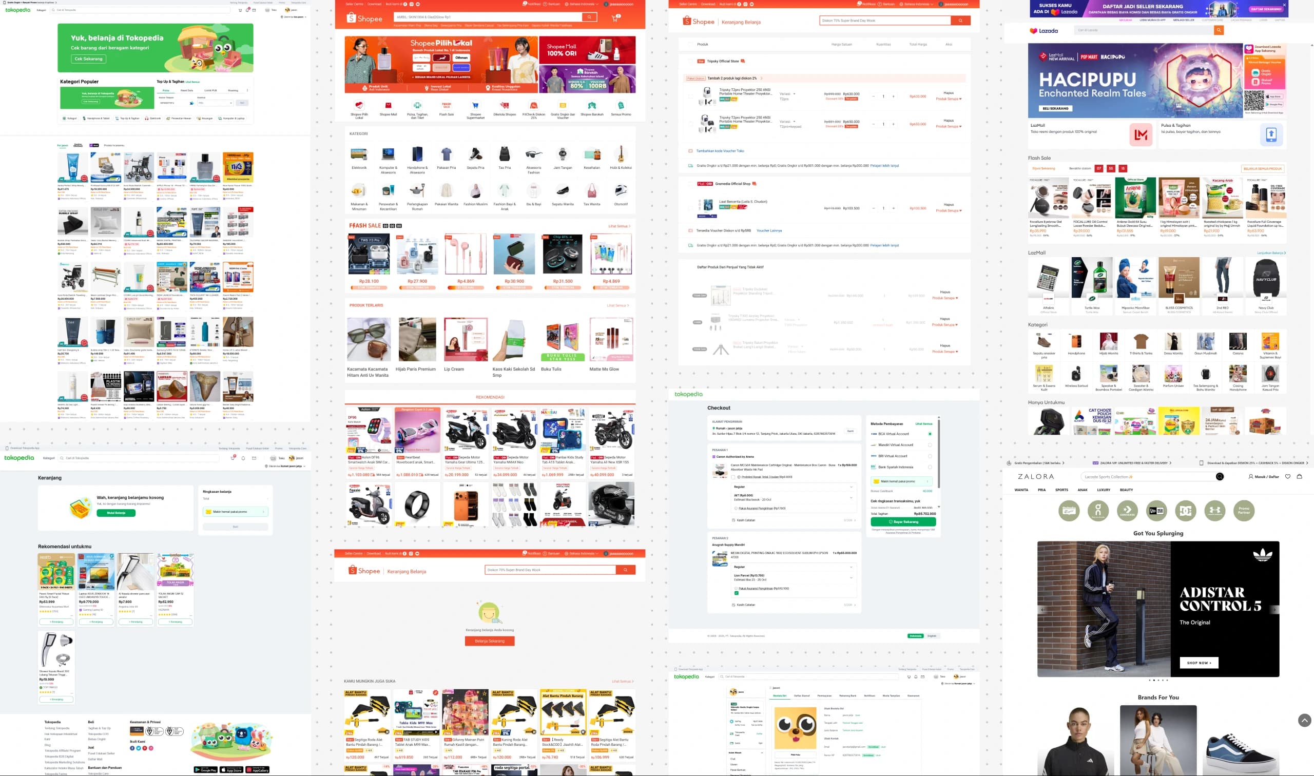
Denser catalogs
Stronger categorization
Search and filter emphasis
Direct product access
Rather than choosing between a purely editorial discovery experience and a dense catalog-first marketplace, I used the comparison to shape a direction that could support more direct product access when shoppers had clearer intent, while still creating opportunities for exploration through franchises, campaigns, collections, and related merchandise.
From there, the redesign was guided by three principles: strengthen visual focus around products, create clearer paths for product discovery, and support purchase decisions through clearer signals. These principles became the basis for restructuring the homepage, catalog browsing, product presentation, and supporting interactions throughout the experience.
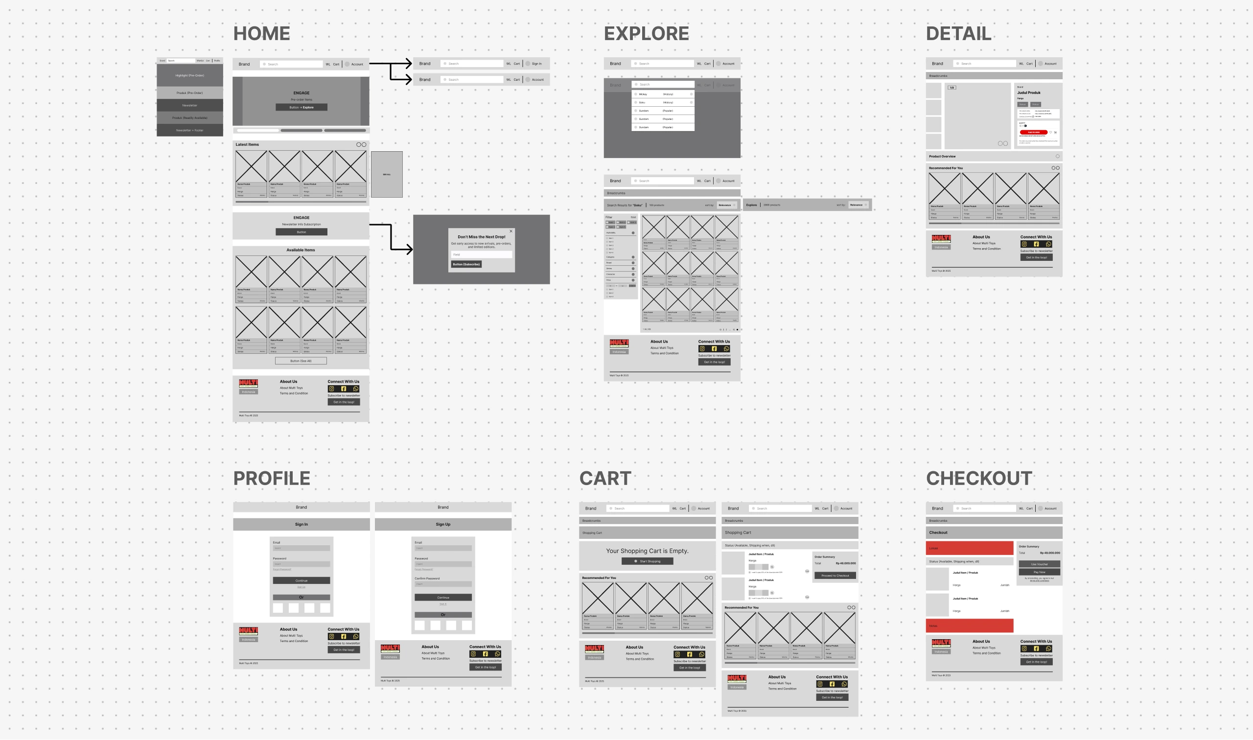
Before refining the visual design, I mapped the core shopping journey across key pages.
The wireframes translated the earlier principles into page structure and interaction flow, clarifying how users could enter the catalog, move between browsing and evaluation, access supporting actions, and continue through purchase.
The redesign introduced clearer visual priorities between brand content, products, and supporting actions. Stronger hierarchy, more deliberate use of brand color, and greater emphasis on product imagery gave collectibles and key actions a more distinct role throughout the experience.
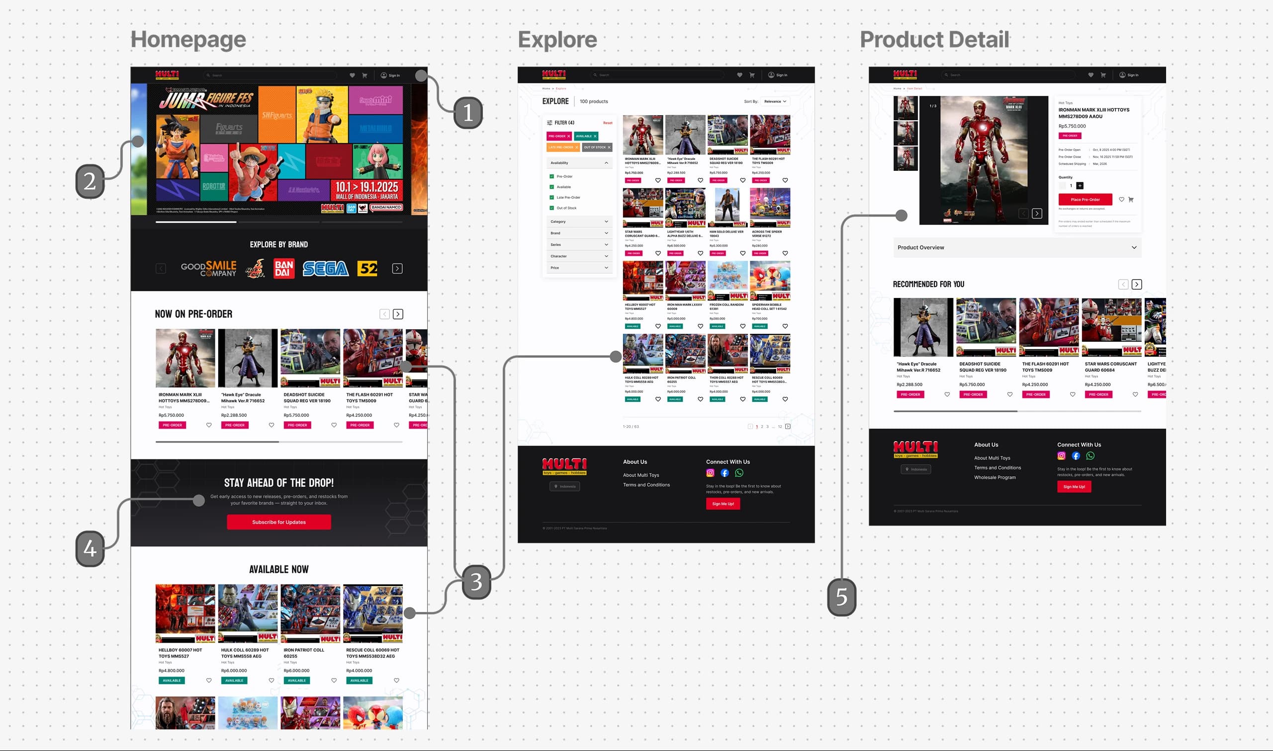
More visible profile and wishlist actions
Stronger hero section
Increased product prominence helps shift attention toward collectibles and featured products.
Introduced a more prominent subscription experience that highlights the benefits of staying informed about upcoming releases and product drops.
Product imagery is prioritized over secondary details to better highlight collectible appeal.
Brand colors are applied more selectively to reduce visual competition and strengthen product visibility.
The redesign created a more structured progression from featured content into deeper catalog exploration. Clearer entry points, recommendations, and persistent wishlist access created more ways to continue exploring, while direct access to the broader catalog remained available.
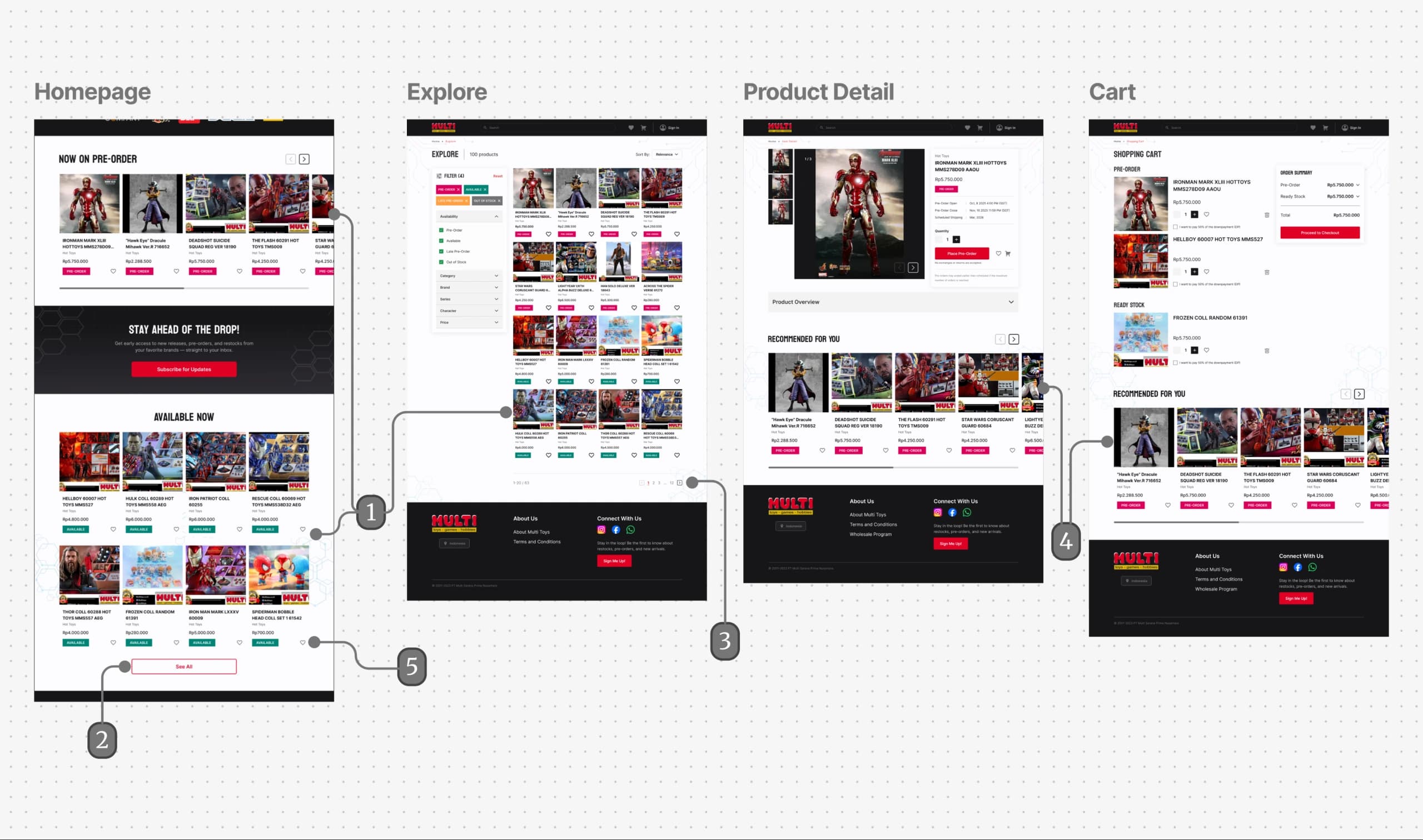
Separating featured content from the full catalog creates a clearer progression from discovery to exploration.
A more prominent catalog entry point encourages users to continue exploring beyond featured products.
Replacing infinite scrolling with pagination reduces browsing fatigue and provides a stronger sense of progression.
Product recommendations encourage users to continue exploring beyond a single item.
Wishlist actions remain accessible throughout browsing, making it easier to revisit products later.
The redesign surfaced product availability and purchase actions more clearly across browsing and product-detail contexts. Distinct purchasing states and stronger action hierarchy made decision-relevant information more prominent throughout the purchase journey.
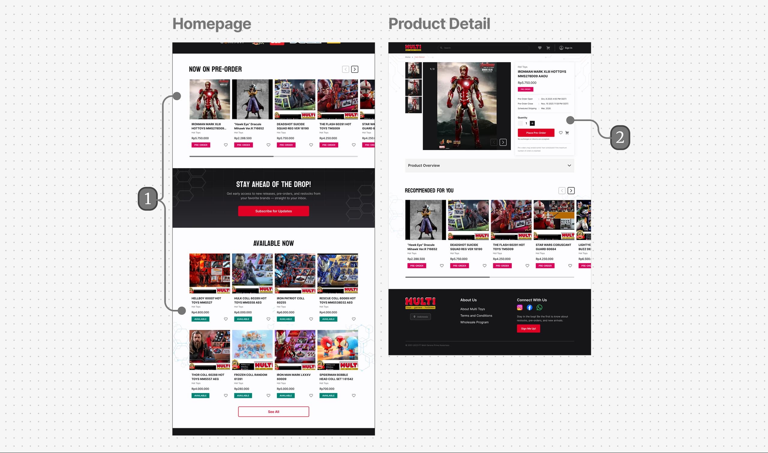
Distinct visual treatments help communicate different purchasing contexts and availability.
Purchase actions receive greater prominence to support faster and more confident decisions.
Mobile was not treated as compressed desktop. Navigation collapsed, modules stacked, grids reduced density, and actions adapted to available space while preserving the same hierarchy and browsing logic.
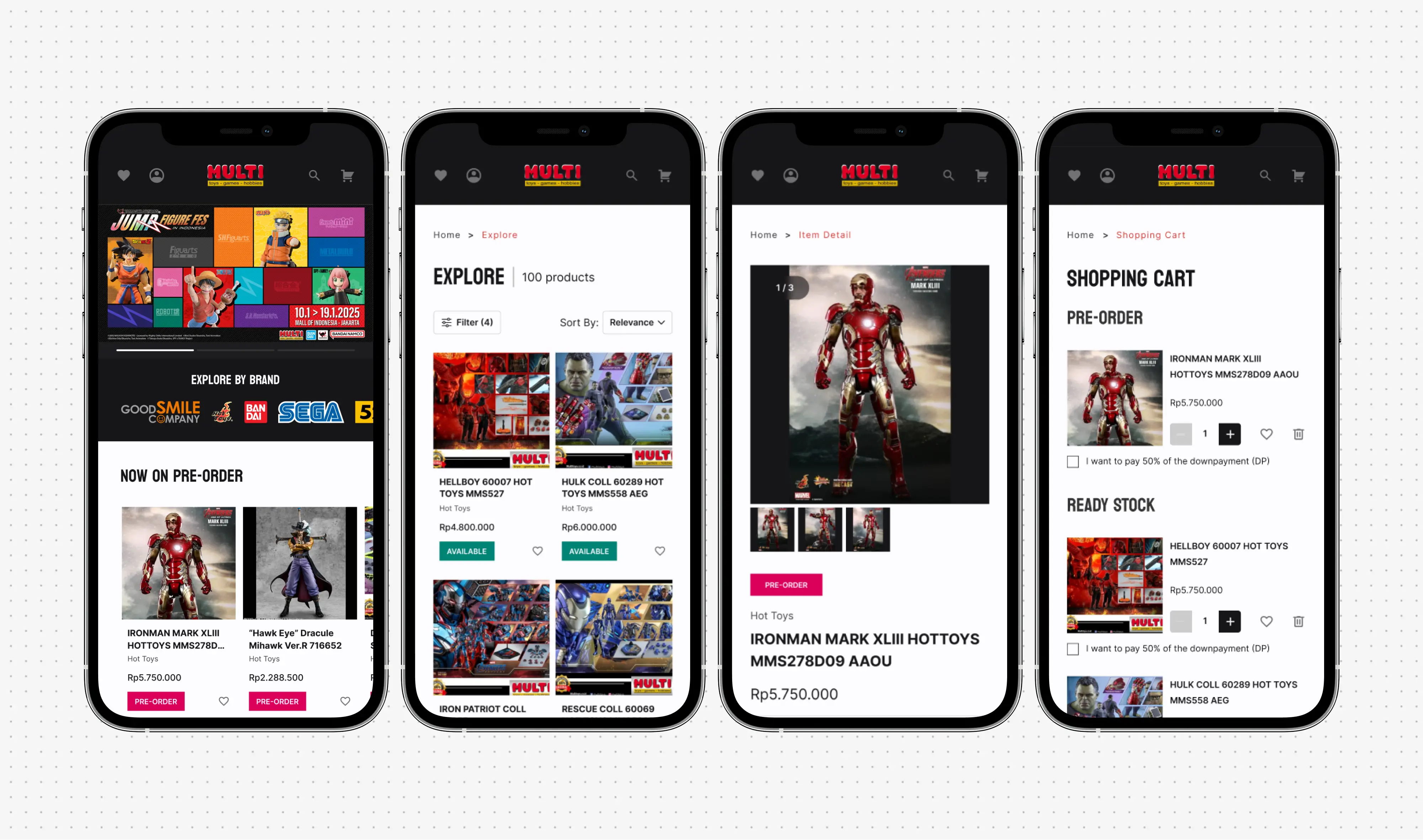
The final direction combined stronger hierarchy, clearer navigation, curated discovery paths, structured catalog browsing, clearer product information, more visible supporting actions, and responsive behavior.
The redesign was later evaluated through a comparative test with 14 participants. The findings reflect participant ratings and interpretations, not post-launch conversion or observed customer behavior.
I compared the existing experience and the redesign with 14 participants to evaluate whether the changes supported the three intended design goals: stronger product focus, clearer product discovery, and better support throughout the purchase journey. Participants rated both experiences on a 7-point scale, alongside open-ended questions about what they understood and remembered from the interface.
Across the four measures, the redesign received higher average ratings, with the clearest improvements appearing in product exploration and managing selected products toward purchase.
Product Focus
How clearly the experience presented collectibles as the primary focus and represented a hobby / collectible store.
Product Exploration
How easily the experience supported browsing and finding relevant products.
Purchase Decision Support
How clearly the experience helped participants understand products and move toward a purchase decision.
Purchase Progression
How easily the experience supported managing selected products and continuing through the purchase process.
When asked which version better represented a premium collectible store and felt more professional for transactions, 79% chose the redesign, compared with 21% for the existing experience.
The open-ended responses added an important nuance. Both versions were generally recognized as stores selling figures, anime merchandise, or collectibles. However, several participants who first saw the redesign initially interpreted the prominent campaign imagery as content related to games or movies before recognizing the store's actual product focus.
This suggested that while the redesign created a stronger overall commerce experience, the relationship between campaign storytelling and immediate product recognition could still be refined.
The audit, client context, and benchmarking identified presentation opportunities. The later comparison with 14 participants showed higher average ratings for the redesign across all four measures and revealed how participants interpreted both versions. However, it did not establish dominant behavior among actual MULTI customers, post-launch conversion impact, or performance in real purchasing contexts.
Existing interface problems identified through the product audit.
How 14 participants rated and interpreted the existing experience and redesign.
Post-launch customer behavior, conversion impact, or performance in real purchasing contexts.
Today, I would separate what the current product shows, what comparable products suggest, what participants report in a comparative test, and what actual customers demonstrate in context. I would investigate whether customers arrive with an exact item, begin from a franchise or category, discover elsewhere and use MULTI only to evaluate, or meaningfully browse without a known target.
That evidence would determine whether known-item retrieval, partially known exploration, or open-ended discovery should receive the strongest hierarchy rather than assuming all three are equally important.
The comparative test showed how participants rated and interpreted both interfaces. A future iteration would examine whether the interaction model supports actual shopping behavior in context.
01
Can someone with an exact or partially known product reach relevant results efficiently?
02
Can someone move from a franchise or collection toward relevant products without an exact item in mind?
03
Can users distinguish important product states and information without unnecessary navigation?
04
Does the wishlist fit naturally into the actual purchase journey?
Redesign work creates a temptation to move directly from a structurally weak interface to a solution. Audits can reveal hierarchy problems, inconsistency, unclear navigation, and missing information. Benchmarks can reveal established patterns and possible interaction models. Neither automatically explains why users behave as they do.
I would still use audit and benchmarking early because they efficiently explain the existing product and solution space, but I now treat them as inputs for hypotheses, not substitutes for behavioral evidence when a decision depends on actual user behavior.
The comparative test added evidence about perceived clarity and preference, but it still did not substitute for observing actual shopping behavior.
More projects across research, commerce, systems, and spatial experiences.
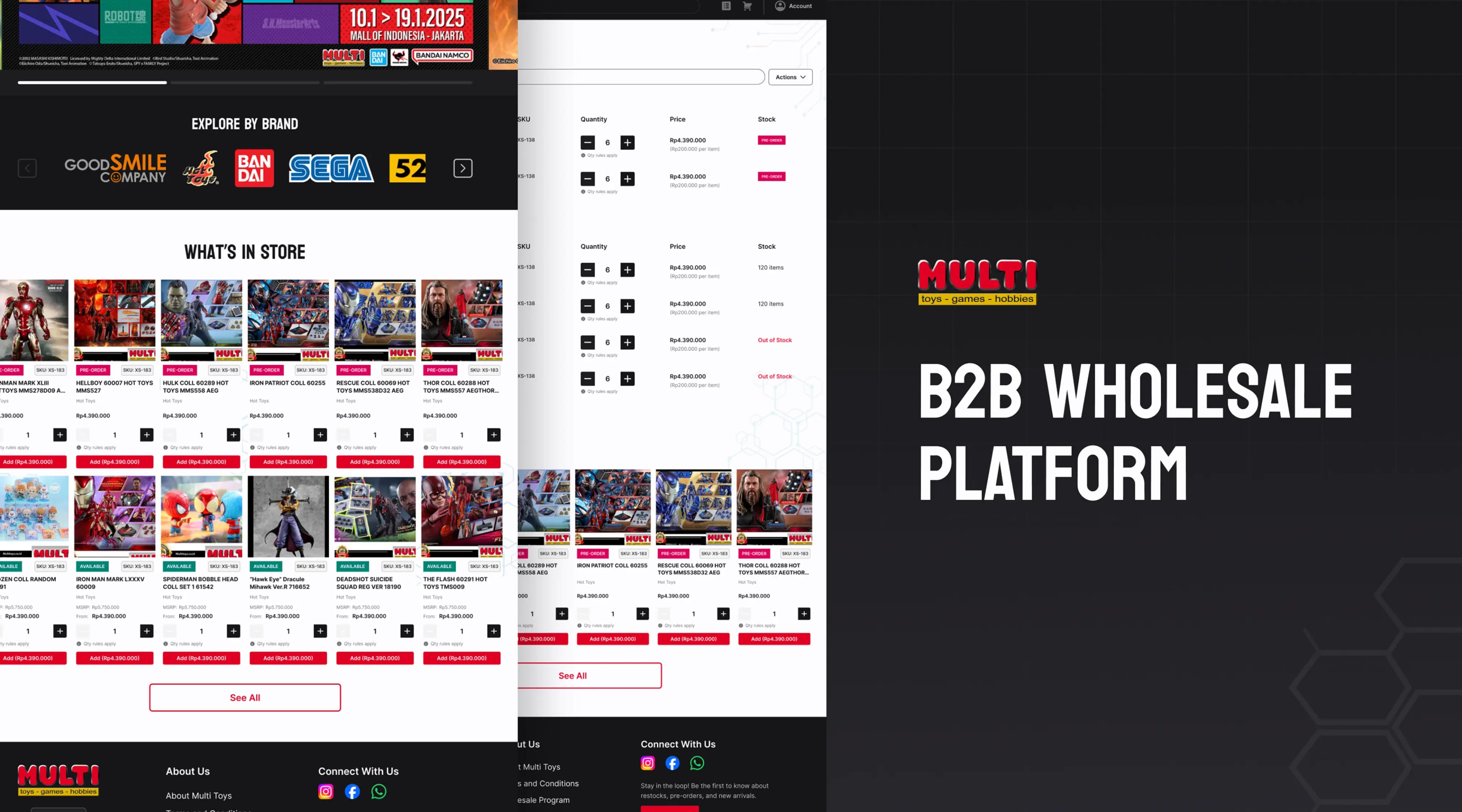
A business purchasing experience built around larger order quantities and recurring wholesale workflows.
Wholesale UX · Complex Flows · Repeat Ordering
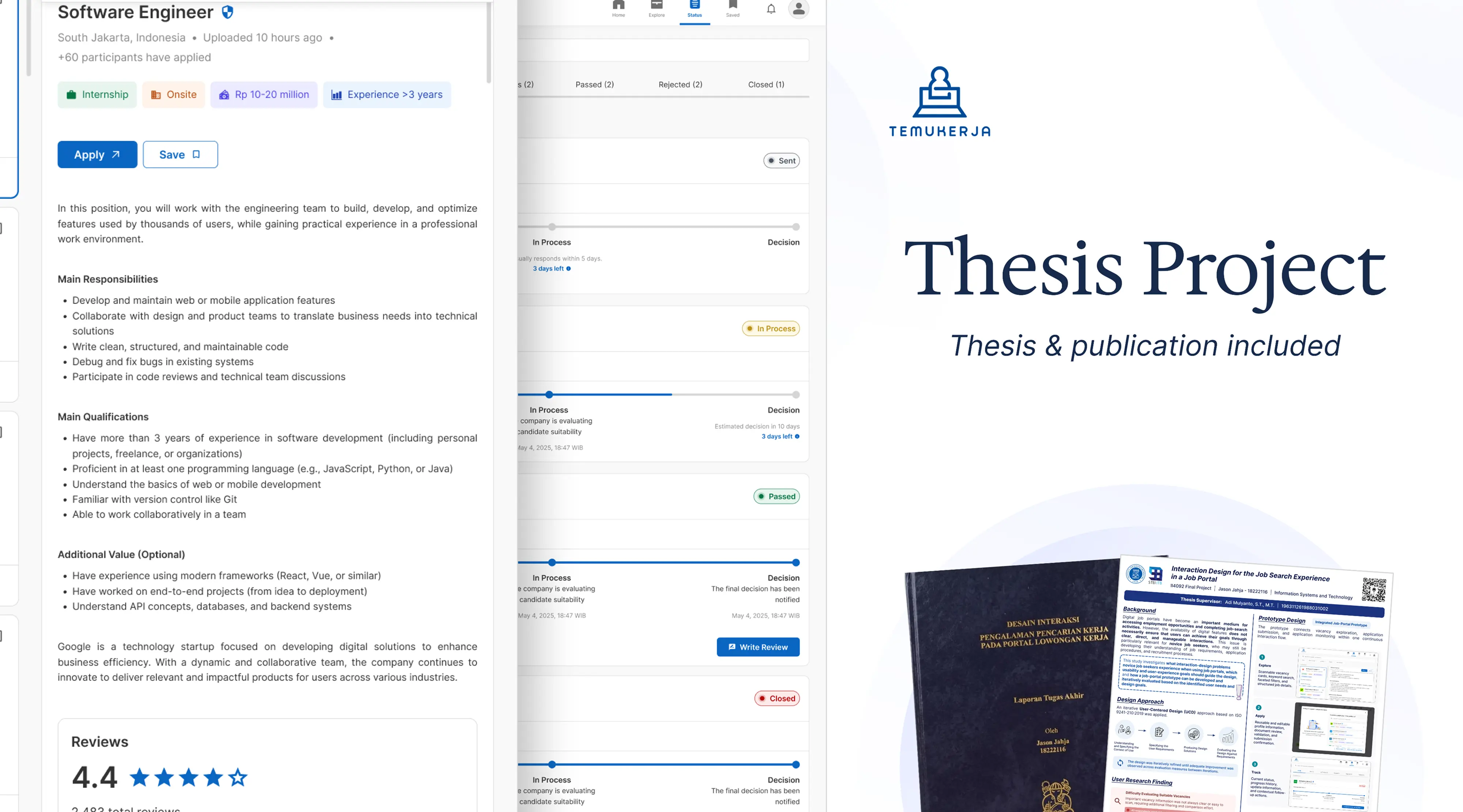
An undergraduate thesis developed through user research and three rounds of formative usability testing with novice job seekers.
UX Research · Usability Testing · Job Portal
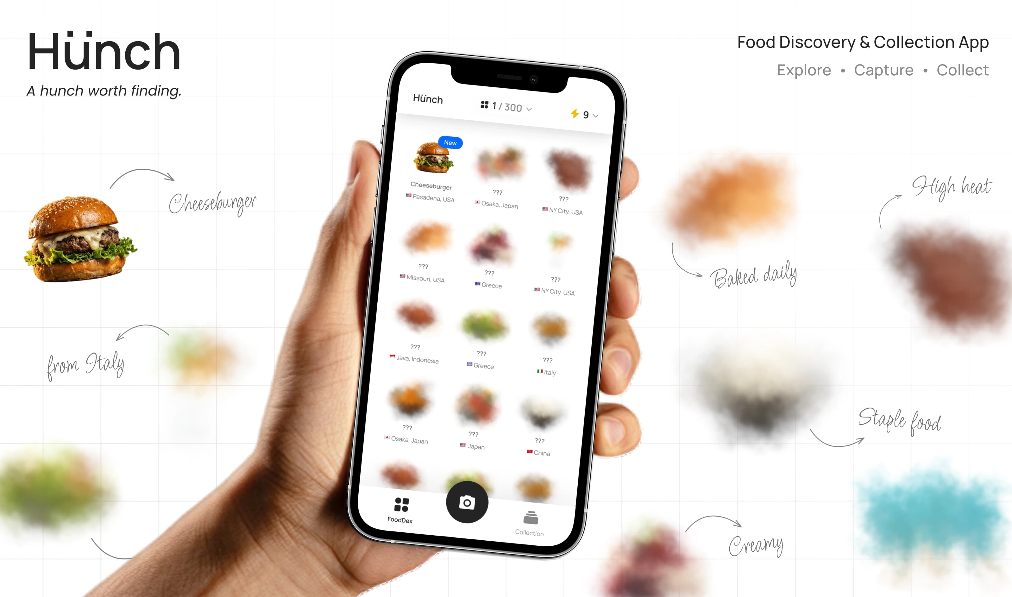
Hunch is a mobile food-discovery and collection experience that lets people identify the food they encounter, uncover what makes it unique, and grow their collection one Hunch at a time.
Product Design · Brand Direction · Usability Testing